On this page5
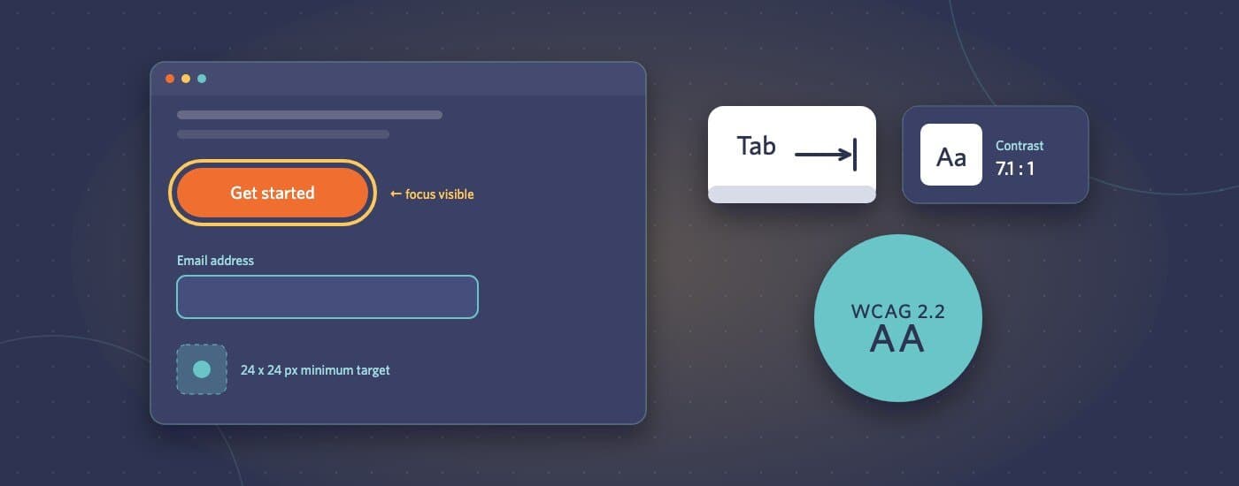
More clients are asking for accessibility by name now. Sometimes it’s a procurement requirement, sometimes it’s the European Accessibility Act, which has applied to many consumer-facing digital services in the EU since June 2025, and sometimes it’s simply the right thing to do. The request is usually “WCAG 2.2 AA”, and it helps to know what that means for an ordinary marketing site in practice.
This isn’t legal advice, and it isn’t the full standard. It’s the practical view: what WCAG 2.2 added, where typical sites fall short, and how to build it in rather than bolt it on.
What WCAG 2.2 added
WCAG 2.2 builds on 2.1, so everything from before still applies. The new success criteria at levels A and AA are:
- Focus Not Obscured (Minimum), AA: when an element receives keyboard focus, it can’t be completely hidden by something else, like a sticky header, a cookie banner or a chat widget.
- Dragging Movements, AA: anything done by dragging, such as a slider, a sortable list or a map, also needs a way to do it without dragging, like buttons or clicks.
- Target Size (Minimum), AA: interactive targets should be at least 24 by 24 CSS pixels, or have enough space around them, with some exceptions such as links within a sentence.
- Consistent Help, A: if help options like contact details or a chat link appear on several pages, they appear in the same relative place each time.
- Redundant Entry, A: don’t make people type the same information twice in one process. Pre-fill it or let them select it.
- Accessible Authentication (Minimum), AA: logging in can’t depend on a memory or puzzle test without an alternative. Allowing password managers and paste is part of meeting it.
One older criterion, 4.1.1 Parsing, was removed as obsolete.
Where marketing sites usually fail
In our experience, the new criteria are rarely the main problem. The common failures are the long-standing ones:
- Colour contrast: light grey text, text over images, and brand colours used for small text
- Keyboard access: menus, modals and carousels that can’t be used without a mouse, or focus that disappears or gets trapped
- Missing or unhelpful alt text: “image1.jpg”, or decorative images read out one after another
- Form labels: placeholder text used instead of real labels, and error messages that aren’t linked to their fields
- Heading structure: headings chosen for their size rather than their meaning, so the page outline makes no sense to a screen reader
- Motion: animations that ignore the “reduce motion” setting
Fix these and a typical site is most of the way there. The 2.2 additions then mostly come down to sticky elements, small tap targets and any drag interactions.
Build it in, don’t bolt it on
Accessibility is cheapest when it’s part of the design and build, not an audit after launch:
- In design: check contrast in the palette, design visible focus states, make targets big enough, and show error states
- In the component library: build menus, modals, tabs and accordions accessibly once, then reuse them everywhere
- In content: give editors fields for alt text and teach them what good alt text looks like
- In QA: keyboard-only testing, an automated scan with a tool like axe or Lighthouse, and a quick screen reader pass on key pages
Automated tools only catch part of the problem, often estimated at around a third of issues. They’re a useful floor, not proof of conformance. Manual testing covers the rest.
Watch out for “overlay” widgets
Plugins that promise to make a site compliant by adding a toolbar or script are popular, and they’re widely criticised by accessibility specialists and many disabled users. They don’t fix the underlying code, and they can get in the way of the assistive technology people already use. There’s no shortcut around building the site properly.
What to put in the proposal
When a client asks for WCAG 2.2 AA, spell out what you’ll deliver:
- Which pages and templates are in scope
- How it will be tested (automated tools, manual keyboard and screen reader checks)
- What’s excluded, such as third-party widgets the client controls, or content added after launch
- Whether an independent audit or an accessibility statement is part of the job
That keeps the promise specific and something you can actually meet.
Accessibility and performance fixes are the core of our performance and accessibility work, whether that’s a new build or improving an existing site. Send the site or the designs through our project brief form and we’ll tell you where it stands.