On this page8
The first time a client sees a build should not be the first time anyone has checked it against the design. That sounds obvious, but in practice a lot of front-end work goes out with QA done in the review meeting, with the client pointing at the screen.
Here is the checklist we run on a Figma-to-code build before anyone outside the team sees a staging link. None of it is exotic. The point is that it’s done every time, in the same order.
Before any code: read the design like a developer
QA starts before the build. We go through the Figma file looking for the things that cause rework later:
- Inconsistent values. Three slightly different greys, spacing that’s 23px in one place and 24px in another, two versions of the same button. We flag these and ask which one is intended rather than coding all of them.
- Missing breakpoints and states. If there’s no mobile design for a complex section, or no error state for a form, we raise it now, not after it’s built.
- Components that aren’t really components. Cards that look the same but are built differently in each frame. Deciding on one component early keeps the code, and the CMS, simpler.
A short list of questions at this stage saves days later. It also gives the client a chance to fix things in the design, where changes are cheap.
Visual accuracy at every breakpoint
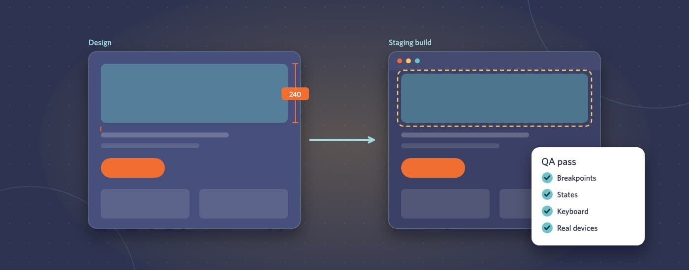
Once a page is built, we compare it with the design at each designed width, and at the awkward widths in between. The useful checks are specific:
- Spacing and alignment against the design’s grid, not by eye
- Type: font, weight, size, line height, letter spacing
- Colours taken from the design tokens, not sampled from screenshots
- Images cropped the way the designer intended at each size
- Nothing overflowing, overlapping or causing sideways scrolling between the designed breakpoints
Overlaying the design on the build is the fastest way to catch small drift. Browser extensions and Figma’s own tools both make this easy, and a two-pixel difference is obvious when the two images sit on top of each other.
Real content, not the designer’s perfect copy
Designs use copy that fits. Real content rarely does. We test every component with:
- Headlines that run to three lines
- Very short and very long names, prices and labels
- Missing optional fields, such as a card without an image or a team member without a job title
- Lists with one item, and lists with twenty
If the site runs on a CMS, this is where we also check that editors can’t easily break a layout, for example by pasting a huge image or leaving a required field empty.
Interaction and states
Every interactive element gets clicked, tapped and tabbed to:
- Hover, focus and active states match the design, or the agreed default
- Menus open and close properly on touch devices, not only with a mouse
- Forms validate sensibly, show clear errors and confirm success
- Animations run smoothly and respect the “reduce motion” setting
- Links go where they should, and external links behave as agreed
Browsers and real devices
We test the current and previous versions of Chrome, Safari, Firefox and Edge on desktop, plus Safari on iOS and Chrome on Android. Simulators are fine for quick checks, but we always look at real phones before handover. Scrolling behaviour, fixed headers and form inputs are where simulators and real devices disagree most often.
Accessibility basics
A full accessibility audit is a separate piece of work, but every build should pass the basics:
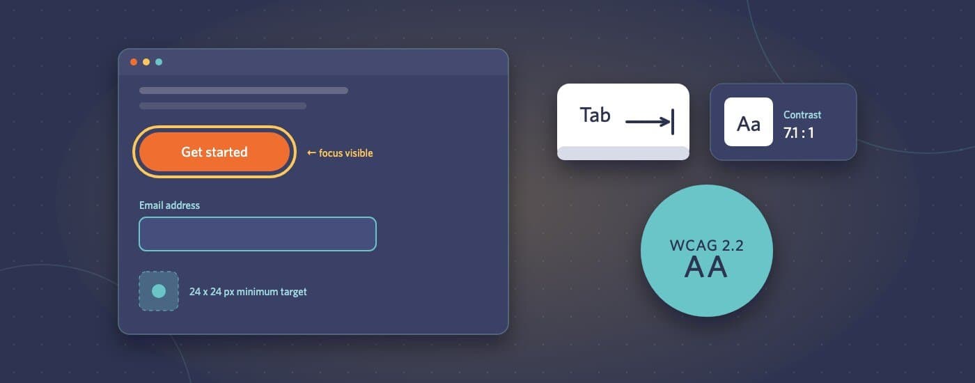
- The whole page can be used with a keyboard, with a visible focus indicator
- Text meets WCAG contrast ratios against its background
- Images have meaningful alt text, and decorative ones are hidden from screen readers
- Headings follow a logical order, and form fields have real labels
- Nothing important is communicated by colour alone
Automated tools like Lighthouse and axe catch a good share of these problems. A quick pass with a screen reader catches the rest of the obvious ones.
Performance
We check Core Web Vitals on the pages that matter most, usually the homepage and the main templates. The common fixes are unglamorous: correctly sized images in modern formats, fonts that don’t block rendering, and no script loaded on pages that don’t use it. It’s much easier to keep a site fast from the start than to speed it up later.
Then, and only then, the staging link
When the client gets the link, their feedback should be about the work itself, whether it’s the right direction and whether the content reads well, not about a button that’s the wrong colour on mobile. We collect feedback in whatever tool the agency already uses (BugHerd, Markup.io, Jira or a shared document) so nothing gets lost between email threads.
If you’d like to see how this works on your next project, send the design files through our project brief form and we’ll come back with a fixed estimate and timeline.