MyChannel TV
The design team at MyChannel TV needed to launch their website fast and they couldn't code the front-end of their new landing page in time. We developed all the markup for them to be able to launch their website as quickly as possible.
Take a look at the code below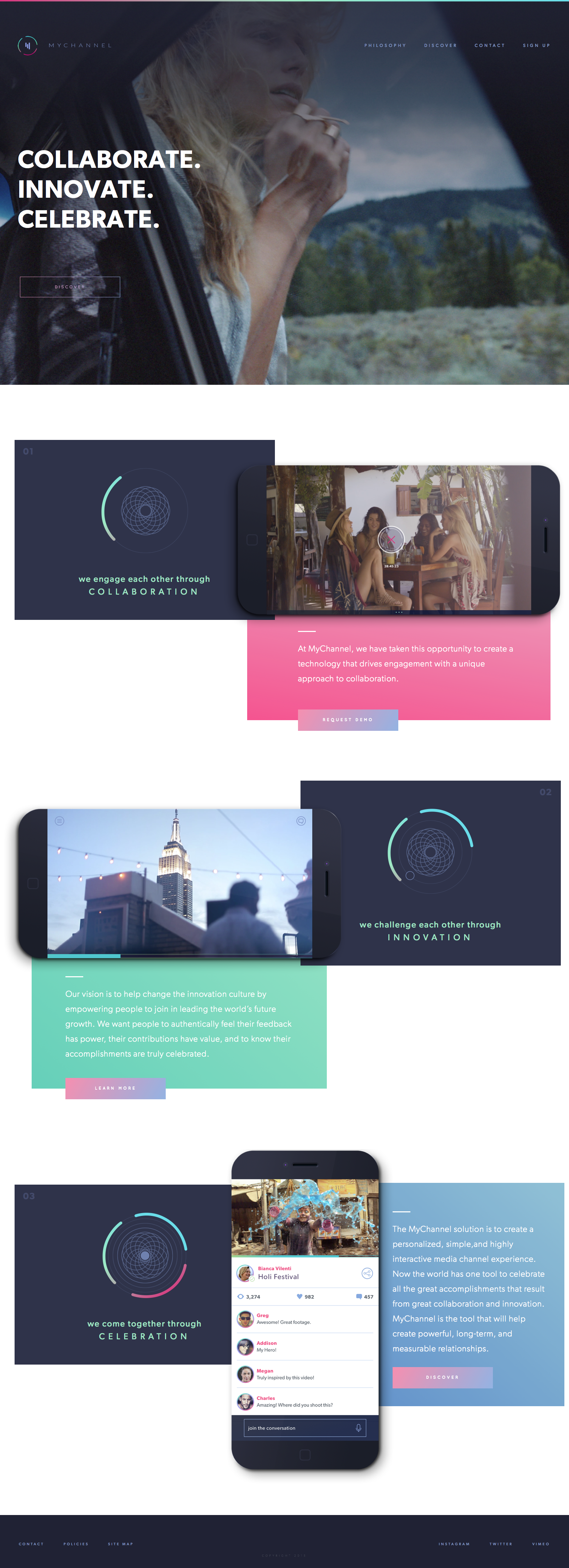
<!DOCTYPE html>

<!--[if IE 8]> <html class="ie8 oldie" lang="en"> <![endif]-->

<!--[if gt IE 8]><!-->

<html lang="en">

<!--<![endif]-->

<head>

  <meta charset="utf-8">

  <title>MYC</title>

  <meta name="viewport" content="width=device-width, initial-scale=1, maximum-scale=1, minimum-scale=1, user-scalable=no">

  <link rel="stylesheet" media="all" href="css/style.css">

  <!--[if lt IE 9]>

  <script src="http://html5shiv.googlecode.com/svn/trunk/html5.js"></script>

<![endif]-->

</head>

<body>

  <div class="wrapper">

      <div class="inner">

          <div class="features">

              <header id="header">

                  <div class="holder">

                      <div class="line"></div>

                      <div class="container">

                          <a title="MYC" href="#" id="logo" title="MYC">MYC</a>

                          <div class="trigger"></div>

                      </div>

                  </div>

                  <nav id="menu">

                      <div class="container">

                          <ul class="menu-list">

                              <li><a title="PHILOSOPHY" href="#">PHILOSOPHY</a></li>

                              <li><a title="DISCOVER" href="#">DISCOVER</a></li>

                              <li><a title="CONTACT" class="contacts-fancy" href="#fancy">CONTACT</a></li>

                              <li><a title="SIGN UP" href="#">SIGN UP</a></li>

                          </ul>

                      </div>

                  </nav>

                  <!-- / navigation -->

              </header>

              <!-- / header -->

              <div class="hold">

                  <div class="container">

                      <h1>COLLABORATE.<br>INNOVATE.<br>CELEBRATE.</h1>

                      <a title="" class="btn bor" href="#"><span>DISCOVER</span></a>

                  </div>

              </div>

          </div>

          <div class="container">

              <section class="landing">

                  <article class="item-1">

                      <div class="main-item">

                          <p>01</p>

                          <div class="pic">

                              <img src="img/1.svg" alt="">

                          </div>

                          <h3>we engage each other through<span>COLLABORATION</span></h3>

                      </div>

                      <div class="info">

                          <div class="pic">

                              <img src="img/2.png" alt="">

                          </div>

                          <div class="hold">

                              <p>At MyChannel, we have taken this opportunity to create a technology that drives engagement with a unique approach to collaboration.</p>

                              <a title="REQUEST DEMO" class="btn full" href="#">REQUEST DEMO</a>

                          </div>

                      </div>

                  </article>

                  <article class="item-2">

                      <div class="main-item">

                          <p>02</p>

                          <div class="pic">

                              <img src="img/4.svg" alt="">

                          </div>

                          <h3>we challenge each other through<span>INNOVATION</span></h3>

                      </div>

                      <div class="info">

                          <div class="pic">

                              <img src="img/3.png" alt="">

                          </div>

                          <div class="hold">

                              <p>Our vision is to help change the innovation culture by empowering people to join in leading the world’s future growth. We want people to authentically feel their feedback has power, their contributions have value, and to know their accomplishments are truly celebrated.</p>

                              <a title="LEARN MORE" class="btn full" href="#">LEARN MORE</a>

                          </div>

                      </div>

                  </article>

                  <article class="item-3">

                      <div class="main-item">

                          <p>03</p>

                          <div class="pic">

                              <img src="img/5.svg" alt="">

                          </div>

                          <h3>we come together through<span>CELEBRATION</span></h3>

                      </div>

                      <div class="info">

                          <div class="pic">

                              <img class="mobile-no" src="img/6.png" alt="">

                              <img class="mobile-on" src="img/3.png" alt="">

                          </div>

                          <div class="hold">

                              <p>The MyChannel solution is to create a personalized, simple,and highly interactive media channel experience. Now the world has one tool to celebrate all the great accomplishments that result from great collaboration and innovation. MyChannel is the tool that will help create powerful, long-term, and measurable relationships.</p>

                              <a title="DISCOVER" class="btn full" href="#">DISCOVER</a>

                          </div>

                      </div>

                  </article>

              </section>

          </div>

          <footer id="footer">

              <div class="container">

                  <ul class="left-menu">

                      <li><a title="CONTACT" href="#">CONTACT</a></li>

                      <li><a title="POLICIES" href="#">POLICIES</a></li>

                      <li><a title="SITE MAP" href="#">SITE MAP</a></li>

                  </ul>

                  <div class="mid">

                      <a title="" class="logo" href="#"><img src="img/pic_logo.svg" alt=""></a>

                      <p class="copy">COPYRIGHT 2015</p>

                  </div>

                  <ul class="right-menu">

                      <li><a title="INSTAGRAM" href="#">INSTAGRAM</a></li>

                      <li><a title="TWITTER" href="#">TWITTER</a></li>

                      <li><a title="VIMEO" href="#">VIMEO</a></li>

                  </ul>

              </div>

          </footer>

          <!-- / footer -->

          <div id="fancy" class="contacts-fancybox">

              <div class="holder">

                  <h4 class="title">WHAT CAN WE HELP WITH?</h4>

                  <form action="#">

                      <section class="radios">

                          <article>

                              <input name="radio" checked type="radio">

                              <label class="radio1"><span><img src="img/ico_radio_1.svg" alt=""></span>general</label>

                          </article>

                          <article>

                              <input name="radio" type="radio">

                              <label class="radio2"><span><img src="img/ico_radio_2.svg" alt=""></span>demo</label>

                          </article>

                          <article>

                              <input name="radio" type="radio">

                              <label class="radio3"><span><img src="img/ico_radio_3.svg" alt=""></span>support</label>

                          </article>

                      </section>

                      <input placeholder="name" type="text">

                      <input placeholder="email" type="text">

                      <textarea placeholder="message" type="text"></textarea>

                      <button class="btn full">SEND</button>

                  </form>

              </div>

              <a title="cancel" class="close" href="#">cancel</a>

          </div>

      </div>

  </div>

  <script src="http://code.jquery.com/jquery-1.11.3.min.js"></script>

  <script>

  window.jQuery || document.write("<script src='js/jquery-1.11.3.min.js'>\x3C/script>")

  </script>

  <script src="js/plugins.js"></script>

  <script src="js/main.js"></script>

</body>

</html>
html, body, div, span, applet, object, iframe,
h1, h2, h3, h4, h5, h6, p, blockquote, pre,
a, abbr, acronym, address, big, cite, code,
del, dfn, em, img, ins, kbd, q, s, samp,
small, strike, strong, sub, sup, tt,
var,
b, u, i, center,
dl, dt, dd, ol, ul, li,
fieldset, form, label, legend,
table, caption, tbody, tfoot, thead, tr, th, td,
article, aside, canvas, details, figcaption, figure,
footer, header, hgroup, menu, nav, section, summary,
time, mark, audio, video {
margin: 0;
padding: 0;
border: 0;
font - size: 100 % ;
font: inherit;
vertical - align: baseline;
}
* , * : before, * : after {
-moz - box - sizing: border - box; - webkit - box - sizing: border - box;
box - sizing: border - box;
}
::-webkit - input - placeholder {
color: inherit;
}
::-moz - placeholder {
color: inherit;
opacity: 1;
}
input[type = tel], input[type = url], input[type = password],
input[type = text], input[type = email], input[type = reset],
input[type = button], input[type = submit], button, textarea {
-webkit - appearance: none; - webkit - border - radius: 0;
}
article, aside, details, figcaption, figure,
footer, header, hgroup, menu, nav, section {
display: block;
}
img {
vertical - align: middle;
}
ol, ul {
list - style: none;
}
blockquote, q {
quotes: none;
}
blockquote: before, blockquote: after,
q: before, q: after {
content: '';
content: none;
}
table {
border - collapse: collapse;
border - spacing: 0;
}
a[href], label[
for], select,
input[type = checkbox], input[type = radio] {
cursor: pointer;
}
button, input[type = button], input[type = image],
input[type = reset], input[type = submit] {
padding: 0;
overflow: visible;
cursor: pointer;
}
button::-moz - focus - inner,
input[type = button]::-moz - focus - inner,
input[type = image]::-moz - focus - inner,
input[type = reset]::-moz - focus - inner,
input[type = submit]::-moz - focus - inner {
border: 0;
}
.hide {
position: absolute!important;
left: -9999e m!important;
}
.clearfix: after {
content: "";
display: block;
clear: both;
}
h1, h2, h3, h4, h5, h6 {
font - weight: normal;
}
strong {
font - family: 'Gibson-Bold';
}
em {
font - style: italic;
}
del {
text - decoration: line - through;
}
th, td {
vertical - align: top;
}
th {
font - weight: normal;
text - align: left;
}
address, cite, dfn {
font - style: normal;
}
abbr, acronym {
border - bottom: 1 px dotted #999;
cursor: help;
}
sub,
sup {
position: relative;
font-size: 75%;
line-height: 0;
}
sup {
top: -0.5em;
}
sub {
bottom: -0.25em;
}
textarea {
overflow: auto;
}
/* Normalized Styles
------------------------------------------------------------------------------*/
body {
font: 24px/42px 'Gibson-Regular';
color: # 333;
background: #fff; - webkit - text - size - adjust: none;
}
input, textarea, select, button {
outline: none;
font - family: Arial,
Helvetica,
sans - serif;
}
a {
text - decoration: none;
color: #d8833d;
}
a: hover {
text - decoration: underline;
}
.mobile - no {
display: block!important;
}
.mobile - on {
display: none!important;
}
.container {
max - width: 1920 px;
margin: auto;
width: 100 % ;
}
/* Header
------------------------------------------------------------------------------*/
#
header {
height: 218 px;
}
#
header.line {
height: 4 px;
display: block;
background - image: linear - gradient(-121 deg, #56DDEA 0%, # 97E8 C5 49 % , #DE3B7C 100 % );
}
#
logo {
width: 263 px;
height: 55 px;
display: block;
cursor: pointer;
text - indent: -9999e m;
background: url(.. / img / logo.png) no - repeat;
float: left;
margin: 97 px 0 0 104 px;
background - size: 100 % 100 % ;
}
.type - 2# logo {
margin: 99 px 0 0 93 px;
}
/* Navigation
------------------------------------------------------------------------------*/
#
menu {
float: right;
padding: 100 px 80 px 0 0;
}
.type - 2# menu {
padding: 102 px 90 px 0 0;
}
#
menu li {
float: left;
padding - left: 48 px;
}
#
menu a {
font - size: 12 px;
color: #7C99CB;
letter-spacing: 5px;
line-height: 14px;
}
# menu a: hover {
color: #FA83A4;
text - decoration: none;
}
/* features
------------------------------------------------------------------------------*/
.features {
background: url(.. / img / bg_features.jpg) no - repeat;
height: 1082 px;
background - size: cover;
background - position: 50 % 50 % ;
}
.features.hold {
padding: 187 px 0 0 100 px;
}
.features.hold h1 {
font - family: Gibson - SemiBold;
font - size: 69.94 px;
color: #FFFFFF;
letter - spacing: 1.5 px;
line - height: 84 px;
padding - bottom: 121 px;
}
.features.hold.btn {
margin - left: 6 px;
}
a.btn,
.btn {
border: 1 px solid# FA83A4;
color: #FA83A4;
font - family: Quicksand - Bold;
font - size: 12 px;
letter - spacing: 3 px;
height: 60 px;
line - height: 58 px;
min - width: 282 px;
text - align: center;
display: inline - block;
}
a.btn.bor,
.btn.bor {
border: 0;
background: -webkit - linear - gradient(left, #FA83A4, #7FABDF);
-webkit-background-clip: text;
-webkit-text-fill-color: transparent;
}
.ie9 a.btn.bor,
.ie9 .btn.bor {
border: 1px solid # FA83A4; background: none;
}
a.btn.bor span,
.btn.bor span {
display: block;
border - left: 1 px solid# D98EB4;
border - right: 1 px solid #8BA7D9;
background-image: linear-gradient(left, # D98EB4,
#8BA7D9), linear-gradient(left, # D98EB4,
#8BA7D9);
background-image: -webkit-linear-gradient(left, # D98EB4,
#8BA7D9), -webkit-linear-gradient(left, # D98EB4,
#8BA7D9);
background-size: 100% 1px;
background-position: 0 0px, 0 100%;
background-repeat: no-repeat;
}
a.btn.full,
.btn.full {
color: # fff;
border: none;
background: #FA83A4;
background - image: linear - gradient(120 deg, #FA83A4 0 % , #7FABDF 100%);
letter-spacing: 4px;
}
a.btn.full:hover,
.btn.full:hover {
background: # ee76af; text - decoration: none;
}
a.btn.full: focus,
.btn.full: focus {
box - shadow: inset 0 0 0 2 px# ee76af;
}
a.btn.full: active,
.btn.full: active {
background: #d1689a;
}
/* discover
------------------------------------------------------------------------------*/
.discover {
padding: 55 px 0 85 px 0;
overflow: hidden;
clear: both;
}
.discover article {
padding - bottom: 117 px;
}
.discover article: after {
content: "";
display: block;
clear: both;
}
.discover.item - 1.pic {
float: left;
margin - left: -7.1 % ;
width: 71 % ;
}
.discover.item - 1.pic img {
width: 100 % ;
}
.discover.item - 1.info {
float: right;
width: 35.2 % ;
padding - right: 5 % ;
padding - top: 118 px;
}
.discover article h2 {
font - family: Gibson - SemiBold;
font - size: 69.94 px;
color: #7FABDF;
letter-spacing: 1px;
line-height: 68px;
padding-bottom: 37px;
position: relative;
margin-bottom: 38px;
}
.discover .type-2 h2 {
color: # fff;
padding - bottom: 40 px;
margin - bottom: 40 px;
}
.discover article h2: after {
position: absolute;
content: "";
left: 0;
opacity: 0.28;
height: 3 px;
width: 50 px;
background: #276994;
bottom: 0;
}
.discover .type-2 {
padding-bottom: 112px;
}
.discover .type-2 h2:after {
background: # fff;
opacity: 1;
}
.discover article p {
font - family: Gibson - Light;
font - size: 24 px;
color: #656F78;
letter-spacing: 1px;
line-height: 42px;
}
.discover .type-2 p {
font-family: Gibson-Regular;
color: # FFFFFF;
}
.discover.type - 2.info {
float: left;
min - height: 1074 px;
background - size: cover;
background - position: 50 % 50 % ;
width: 43.5 % ;
margin: 140 px - 9.7 % 0 5 % ;
padding: 288 px 13 % 281 px 6 % ;
}
.discover.item - 3.info {
margin - top: 170 px;
}
.discover.item - 4.info {
margin - top: 32 px;
padding - top: 308 px;
min - height: 1113 px;
}
.discover.type - 2.pic {
float: left;
width: 36.2 % ;
position: relative;
z - index: 99;
}
.discover.item - 3.pic {
width: 36.7 % ;
margin - left: 0.2 % ;
}
.discover.item - 4.pic {
width: 61.7 % ;
margin - left: -2.5 % ;
margin - top: 285 px;
}
.discover.type - 2.pic.tag {
position: absolute;
background: #101D38;
box-shadow: 15px 15px 18px 0px rgba(20,28,42,0.26);
border-radius: 8px;
top: 7.6%;
width: 92px;
left: -3.2%;
text-align: center;
font-family: Gibson-Light;
font-size: 15.98px;
color: # FFFFFF;
letter - spacing: 0.25 px;
line - height: 25 px;
padding: 32 px 0 9 px 0;
z - index: 889;
}
.discover.item - 4.pic.tag {
top: 0 % ;
left: 6 % ;
}
.discover.type - 2.pic.tab - ico {
height: 36 px;
width: auto;
margin - bottom: 29 px;
}
.discover.type - 2.pic.tag img {
width: auto;
}
.discover.type - 2.pic img {
z - index: 888;
width: 100 % ;
position: relative;
}
.discover.type - 2.pic ul {
position: absolute;
left: 100 % ;
width: 65 % ;
top: 24.9 % ;
padding - left: 27 px;
}
.discover.item - 3.pic ul {
top: 19.3 % ;
padding - left: 14 px;
}
.discover.item - 4.pic ul {
top: 96 % ;
padding - left: 0;
left: 27 % ;
width: auto;
}
.discover.type - 2.pic ul li {
display: block;
position: relative;
float: left;
clear: left;
margin - bottom: 85 px;
}
.discover.item - 3.pic ul li {
margin - bottom: 135 px;
}
.discover.item - 4.pic ul li {
clear: none;
margin - bottom: 0;
text - align: center;
margin - right: 130 px;
}
.discover.type - 2.pic ul li: after {
position: absolute;
height: 260 px;
left: 4 px;
bottom: 50 % ;
width: 1 px;
display: block;
background: #7FABDF;
content: "";
}
.discover .type-2 .pic ul li:first-child {
z-index: 88;
}
.discover .type-2 .pic ul li:first-child:after {
background: # fff;
}
.discover.type - 2.pic ul li: first - child: before {
position: absolute;
height: 1 px;
right: 100 % ;
top: 50 % ;
width: 200 px;
display: block;
background: #7FABDF;
content: "";
}
.discover .item-4 .pic ul li:first-child:after,
.discover .item-4 .pic ul li:after {
height: 1px;
left: 100%;
background: # 7 FABDF;
top: 39 px;
width: 200 px;
}
.discover.item - 4.pic ul li: last - child: after {
display: none;
}
.discover.type - 2.pic ul li p {
font - size: 24 px;
float: left;
color: #7FABDF;
line-height: 29px;
letter-spacing: 0;
line-height: 72px;
padding-left: 10px;
}
.discover .item-4 .pic ul li p {
float: none;
display: block;
}
.discover .type-2 .pic ul li .ico {
float: left;
text-align: center;
width: 130px;
position: relative;
height: 72px;
line-height: 72px;
margin-right: -7px;
z-index: 9;
}
.discover .item-4 .pic ul li .ico {
float: none;
vertical-align: top;
height: 55px;
width: auto;
display: inline-block;
padding: 0 10px;
background: # fff;
position: relative;
z - index: 99;
}
.discover.item - 4.pic ul li.ico - 3.ico {
padding: 0 23 px;
}
.discover.item - 4.pic ul li.ico - 2 {
margin - right: 170 px;
}
.discover.item - 4.pic ul li.ico - 2.ico {
padding - top: 10 px;
}
.discover.type - 2.pic ul li.ico: after {
position: absolute;
top: 50 % ;
left: 0;
height: 9 px;
width: 9 px;
display: block;
background: #7FABDF;
content: "";
margin-top: -5px;
}
.discover .item-4 .pic ul li:first-child:before {
position: absolute;
display: block;
background: # 7 FABDF;
content: "";
bottom: 85 px;
top: auto;
left: 20 px;
height: 200 px;
width: 1 px;
margin - top: 0;
}
.discover.item - 4.pic ul li.ico: after {
top: 50 % ;
left: -8 px;
margin - top: 7 px;
}
.discover.item - 4.pic ul li.ico: before {
position: absolute;
display: block;
content: "";
height: 1 px;
left: 100 % ;
background: #7FABDF;
top: 39px;
width: 200px;
}
.discover .item-4 .pic ul li:last-child .ico:before {
display: none;
}
.discover .type-2 .pic ul li img {
width: 75px;
}
/* devices
------------------------------------------------------------------------------*/
.devices {
padding: 87px 0 28px 0;
background: url(../img/bg_con_4.jpg) no-repeat 50% 50%;
background-size: cover;
overflow: hidden;
}
.devices .device-1 {
float: left;
width: 25.5%;
margin-left: 6.5%;
padding-top: 8.4%;
position: relative;
}
.devices h3 {
font-family: Gibson-SemiBold;
font-size: 32px;
color: # FFFFFF;
letter - spacing: 0.8 px;
line - height: 38 px;
position: absolute;
top: 0;
left: 0;
display: block;
padding: 38 px 0 10 px 33 px;
text - shadow: -4 px 18 px 14 px rgba(24, 1, 29, 0.17);
}
.devices.device - 2 {
float: left;
width: 25.6 % ;
margin - left: 2.3 % ;
margin - top: 1.7 % ;
}
.devices.device - 3 {
float: left;
width: 34.5 % ;
margin - left: 1.3 % ;
}
.devices img {
width: 100 % ;
}
/* plans
------------------------------------------------------------------------------*/
.title {
font - size: 14 px;
color: rgba(244, 41, 97, 0.85);
letter - spacing: 4.66 px;
line - height: 17 px;
text - align: center;
}
.plans {
padding: 198 px 50 px 0 50 px;
margin - bottom: -13 px;
}
.plans section {
padding: 98 px 0 195 px 0;
overflow: hidden;
}
.plans section article {
width: 33.33 % ;
float: left;
padding: 0 42 px;
position: relative;
}
.plans section img {
width: 100 % ;
}
.plans.holder {
position: relative;
}
.plans.hold {
position: absolute;
left: 0;
bottom: 50 % ;
right: 0;
text - align: center;
width: 100 % ;
margin - bottom: -80 px;
z - index: 9;
font - size: 14 px;
color: #FFFFFF;
letter - spacing: 4.66 px;
line - height: 17 px;
}
.plans.hold img {
width: auto;
margin - bottom: 25 px;
}
.plans section.btn {
width: 100 % ;
display: block;
height: 84 px;
line - height: 80 px;
font - size: 14 px;
}
/* features-con
------------------------------------------------------------------------------*/
.features - con {
background: url(.. / img / bg_con_5.jpg) no - repeat 50 % 50 % ;
background - size: cover;
overflow: hidden;
margin: 0 90 px;
}
.features - con.info {
float: left;
min - height: 886 px;
width: 50.5 % ;
padding: 249 px 50 px 0 82 px;
background: rgba(31, 35, 52, 0.7);
}
.features - con.info h1 {
font - family: Gibson - SemiBold;
font - size: 69.94 px;
color: #FFFFFF;
letter - spacing: 1.75 px;
line - height: 70 px;
position: relative;
padding - bottom: 49 px;
margin - bottom: 41 px;
}
.features - con.info h1 span {
color: #FC2C66;
}
.features - con.info h1: after {
position: absolute;
content: "";
left: 0;
height: 3 px;
width: 50 px;
background: #fff;
bottom: 0;
}
.features - con.info p {
font - family: Gibson - Light;
font - size: 24 px;
color: #FFFFFF;
letter - spacing: 1 px;
line - height: 42 px;
}
/* philosophy
------------------------------------------------------------------------------*/
.philosophy {
padding: 112 px 0 133 px 0;
overflow: hidden;
}
.philosophy.quote {
float: left;
width: 50 % ;
text - align: center;
padding - left: 122 px;
padding - top: 80 px;
}
.philosophy.quote h2 {
display: inline - block;
color: #BE97C1;
font - family: Gibson - Light;
font - size: 145.69 px;
letter - spacing: 3.74 px;
position: relative;
line - height: 240 px;
}
.philosophy.quote h2: after {
position: absolute;
content: "";
left: -107 px;
top: 13 px;
background: url(.. / img / bg_quote.svg) no - repeat;
height: 146 px;
width: 156 px;
}
.philosophy.quote h2: before {
position: absolute;
content: "";
right: -78 px;
bottom: 26 px;
background: url(.. / img / bg_quote_end.svg) no - repeat;
height: 146 px;
width: 156 px;
}
.philosophy.quote h2 span {
display: block;
position: relative;
z - index: 9;
background: -webkit - linear - gradient(left, #D98EB4, #8BA7D9);
-webkit-background-clip: text;
-webkit-text-fill-color: transparent;
}
.philosophy .quote h2 span:before {
position: absolute;
content:"";
right: -77px;
left: -37px;
top: 50%;
background: # F42961; height: 1 px; margin - top: 7 px;
}
.philosophy blockquote {
float: right;
padding - right: 10 % ;
width: 42 % ;
padding - top: 165 px;
}
.philosophy blockquote p {
padding - bottom: 42 px;
letter - spacing: 1 px;
color: #656F78;
}
/* team
------------------------------------------------------------------------------*/
.team section {
padding: 102px 162px 0 162px;
}
.team article {
width: 33.33%;
float: left;
padding: 0 42px 47px 42px;
}
.team article a {
display: block;
position: relative;
background-image: linear-gradient(-180deg, rgba(31,36,50,0.00) 0%, rgba(9,25,59,0.63) 100%);
}
.team article a:before {
position: absolute;
bottom: 0;
top: 50%;
left: 0;
right: 0;
content: "";
background-image: linear-gradient(-180deg, rgba(31,36,50,0.00) 0%, rgba(9,25,59,0.63) 100%);
}
.team article a:after {
position: absolute;
bottom: 0;
left: 0;
right: 0;
height: 8px;
content: "";
background: # 9 FD5BD;
background - image: linear - gradient(60 deg, #56DDEA 0%, # 97E8 C5 49 % , #DE3B7C 100 % );
}
.team article.arrow {
position: absolute;
bottom: 68 px;
right: 21 px;
width: 0;
height: 0;
border - style: solid;
border - width: 14 px 0 14 px 22 px;
border - color: transparent transparent transparent# ffffff;
}
.team article.plus {
position: absolute;
bottom: 63 px;
right: 21 px;
width: 32 px;
height: 32 px;
background: url(.. / img / ico_plus.svg) no - repeat;
}
.team article p {
position: absolute;
bottom: 25 px;
left: -33 px;
background: #F32265;
background - image: linear - gradient(16 deg, #F32265 0 % , #F089AC 100 % );
box - shadow: 0 px 10 px 14 px 0 px rgba(44, 33, 79, 0.35);
font - family: Gibson - Light;
font - size: 32 px;
color: #FFFFFF;
line - height: 38 px;
min - width: 115 px;
padding: 12 px 10 px 15 px 25 px;
}
.team article p strong {
font - size: 24 px;
font - family: Gibson - semibold;
line - height: 29 px;
display: block;
padding - top: 6 px;
}
.team article img {
width: 100 % ;
}
.team article p.slogan {
position: absolute;
bottom: 50 % ;
left: 28 % ;
font - family: Gibson - SemiBold;
font - size: 32 px;
color: #FFFFFF;
line - height: 38 px;
background: none;
box - shadow: none;
margin - bottom: -46 px;
}
.team.bt - social {
display: block;
clear: both;
font - size: 14 px;
color: #7FABDF;
letter-spacing: 5.83px;
line-height: 17px;
text-align: center;
padding: 56px 0 271px 0;
}
.team .bt-social li {
display: inline-block;
padding: 0 65px;
}
.team .bt-social a {
color: # 7 FABDF;
}
/* advisors
------------------------------------------------------------------------------*/
.advisors section {
padding: 75 px 80 px 245 px 35 px;
overflow: hidden;
}
.advisors article {
width: 20 % ;
float: left;
padding: 0 34 px;
}
.advisors article a {
background: #FA83A4;
background - image: linear - gradient(-167 deg, #FA83A4 0 % , #7FABDF 100%);
display: block;
}
.advisors article a img {
position: relative;
top: 23px;
left: 21px;
width: 100%;
box-shadow: 0 10px 20px rgba(9,25,59,0.3);
}
.advisors article h3 {
font-family: Gibson-Light;
font-size: 32px;
color: rgba(244,41,97,0.85);
line-height: 38.11px;
padding: 41px 0 0 24px;
}
.advisors article p {
font-family: Gibson-semibold;
font-size: 18px;
color: # 656 F78; line - height: 36 px; padding: 6 px 0 0 24 px; letter - spacing: 1 px;
}
/* moments
------------------------------------------------------------------------------*/
.moments {
padding - bottom: 103 px;
}
.moments.tab - nav {
text - align: center;
line - height: 0;
padding: 100 px 0 150 px 0;
font - size: 0;
}
.moments.tab - nav li {
display: inline - block;
}
.moments.tab - nav li a {
height: 30 px;
width: 203 px;
display: block;
border: 1 px solid #7FABDF;
font-family: Gibson-SemiBold;
font-size: 22px;
color: # 7 FABDF;
line - height: 28 px;
}
.moments.tab - nav li.current a,
.moments.tab - nav li a: hover {
background: #7FABDF;
text-decoration: none;
color: # fff;
}
.moments section {
padding - bottom: 94 px;
overflow: hidden;
}
.moments article {
float: left;
position: relative;
}
.moments.item - 1 {
margin - left: 4.9 % ;
margin - right: -6.7 % ;
margin - top: 3 % ;
width: 44.5 % ;
}
.moments.item - 2 {
margin - right: -8.4 % ;
width: 25 % ;
position: relative;
z - index: 99;
}
.moments.item - 3 {
margin - top: 19.7 % ;
width: 33.7 % ;
}
.moments.item - 3: after {
position: absolute;
content: "";
left: 45 px;
top: -45 px;
bottom: 64 px;
right: -45 px;
background: #FA457F;
background - image: linear - gradient(10 deg, #FA457F 0 % , #F089AC 100 % );
}
.moments.item - 4 {
float: left;
margin - top: -13.3 % ;
width: 39.1 % ;
margin - left: 9.2 % ;
}
.moments.item - 4: after {
position: absolute;
content: "";
left: -86 px;
top: 141 px;
bottom: -80 px;
right: 237 px;
background: #FA457F;
background - image: linear - gradient(10 deg, #FA457F 0 % , #F089AC 100 % );
}
.moments.item - 5 {
float: left;
margin - top: 7.8 % ;
width: 43.1 % ;
clear: left;
margin - left: 4.9 % ;
}
.moments.item - 6 {
float: left;
margin - top: 2.7 % ;
width: 28.9 % ;
margin - left: -9.75 % ;
position: relative;
z - index: 99;
}
.moments.item - 7 {
float: left;
margin - top: -1.7 % ;
width: 26.2 % ;
margin - left: -2.6 % ;
}
.moments.item - 7: after {
position: absolute;
content: "";
left: -56 px;
top: 363 px;
bottom: -53 px;
right: -43 px;
background: #FA457F;
background - image: linear - gradient(10 deg, #FA457F 0 % , #F089AC 100 % );
}
.moments article img {
width: 100 % ;
z - index: 9;
position: relative;
box - shadow: 0 10 px 20 px rgba(9, 25, 59, 0.3);
}
.moments article a {
display: block;
position: relative;
background - image: linear - gradient(10 deg, #FA457F 0 % , #F089AC 100 % );
}
.moments article a.hold {
position: absolute;
left: 35 px;
right: 0;
bottom: 34 px;
z - index: 99;
}
.moments article a.hold: after {
position: absolute;
content: "";
bottom: 12 px;
right: 45 px;
width: 0;
height: 0;
border - style: solid;
border - width: 14 px 0 14 px 22 px;
border - color: transparent transparent transparent# ffffff;
}
.moments.tab - content {
display: none;
}
.moments.tab - content h4 {
font - family: Gibson - SemiBold;
font - size: 18 px;
color: #FFFFFF;
line - height: 22 px;
padding - bottom: 7 px;
}
.moments.tab - content p {
font - family: Gibson - Light;
font - size: 18 px;
color: #FFFFFF;
letter - spacing: 0.89 px;
line - height: 24 px;
}
.moments.share {
text - align: center;
}
.moments.share a {
font - family: Gibson - Regular;
font - size: 14 px;
color: rgba(244, 41, 97, 0.85);
letter - spacing: 4.66 px;
line - height: 17 px;
}
.moments.share img {
display: block;
margin: 0 auto 21 px auto;
}
/* landing
------------------------------------------------------------------------------*/
.landing {
padding: 155 px 0 0 0;
margin - bottom: -13 px;
}
.landing article {
overflow: hidden;
padding: 0 79 px 218 px 72 px;
}
.landing.main - item {
float: left;
background: #2D344A;
width: 46.35%;
margin-left: 31px;
text-align: center;
z-index: 1;
position: relative;
padding: 0 80px 60px 80px;
}
.landing .item-2 .main-item {
float: right;
margin-left: 0;
margin-right: 13px;
}
.landing .item-3 .main-item {
margin-top: 176px;
}
.landing .main-item p {
font-family: Gibson-SemiBold;
font-size: 25px;
color: # 414 B6A;
letter - spacing: 2 px;
line - height: 30 px;
text - align: left;
padding: 17 px 0 32 px 0;
margin: 0 - 66 px;
display: block;
}
.landing.item - 2.main - item p {
text - align: right;
}
.landing.main - item h3 {
font - size: 28 px;
color: #97E8C5;
letter-spacing: 2px;
line-height: 42px;
padding-top: 68px;
}
.landing .main-item .pic {
height: 334px;
}
.landing .item-2 .main-item h3 {
padding-top: 69px;
}
.landing .main-item h3 span {
display: block;
letter-spacing: 10px;
}
.landing .info {
float: right;
margin-left: -500px;
width: 61%;
padding: 56px 0 0 0;
}
.landing .item-2 .info {
float: left;
margin: 0 -500px 0 0;
width: 61%;
padding: 64px 0 0 0;
}
.landing .item-3 .info {
padding: 0;
margin-top: -10px;
width: 60.4%;
}
.landing .info .pic {
position: relative;
z-index: 9;
margin-bottom: -70px;
}
.landing .item-3 .info .pic {
float: left;
width: 49.4%;
margin-right: -200px;
}
.landing .info img {
max-width: 100%;
}
.landing .info .hold {
opacity: 0.89;
background: # FA457F;
background - image: linear - gradient(10 deg, #FA457F 0 % , #F089AC 100 % );
margin: 0 42 px 0 69 px;
padding: 104 px 80 px 0 143 px;
}
.landing.info.hold p {
font - family: Gibson - Light;
font - size: 24 px;
color: #FFFFFF;
letter - spacing: 1 px;
line - height: 42 px;
padding - bottom: 35 px;
position: relative;
}
.landing.item - 2.info.hold {
opacity: 0.89;
background: #78DABC;
background-image: linear-gradient(-138deg, # 78 DABC 0 % ,
#3FC8B1 100%);
margin: 0 55px 0 79px;
padding: 108px 80px 0 95px;
}
.landing .item-2 .info .hold p {
padding-bottom: 16px;
}
.landing .info .hold p:after {
position: absolute;
content: "";
background: # FFFFFF;
height: 3 px;
width: 50 px;
top: -30 px;
left: 0;
}
.landing.item - 3.info.hold {
background: #7BB9D0;
background-image: linear-gradient(-137deg, # 7 BB9D0 0 % ,
#4286C4 100%);
margin: 105px 3px 0 79px;
padding: 153px 80px 97px 144px;
float: right;
width: 60%;
}
.landing .item-3 .info .hold p {
padding-bottom: 96px;
}
.landing .item-3 .info .hold .btn {
bottom: 0;
}
.landing .info .hold p:after {
position: absolute;
content: "";
background: # FFFFFF;
height: 3 px;
width: 50 px;
top: -30 px;
left: 0;
}
.landing.info.hold.btn {
position: relative;
bottom: -30 px;
}
/* Footer
------------------------------------------------------------------------------*/
#footer {
padding: 57 px 53 px 50 px 77 px;
clear: both;
background: #1F2334;
overflow: hidden;
position: relative;
}
# footer.left - menu {
float: left;
}
#footer.right - menu {
float: right;
}
#footer li {
float: left;
padding: 0 27 px;
}
#footer.right - menu li {
float: left;
}
#footer a {
font - size: 10 px;
color: #7C99CB;
letter-spacing: 4px;
line-height: 14px;
}
# footer.mid {
width: 200 px;
text - align: center;
position: absolute;
top: 37 px;
left: 50 % ;
margin - left: -100 px;
}
#
footer.copy {
opacity: 0.23;
font - family: Gibson - Light;
font - size: 8 px;
color: #FFFFFF;
letter - spacing: 4.8 px;
line - height: 10 px;
padding - top: 22 px;
}
/*! fancyBox v2.1.3 fancyapps.com | fancyapps.com/fancybox/#license */
.fancybox - wrap,
.fancybox - skin,
.fancybox - outer,
.fancybox - inner,
.fancybox - image,
.fancybox - wrap iframe,
.fancybox - wrap object,
.fancybox - nav,
.fancybox - nav span,
.fancybox - tmp {
padding: 0;
margin: 0;
border: 0;
outline: none;
vertical - align: top;
}
.fancybox - wrap {
position: absolute;
top: 0;
left: 0;
z - index: 8020;
}
.fancybox - skin {
position: relative;
color: #000;
text-shadow: none;
}
.fancybox-opened {
z-index: 8030;
}
.fancybox-opened .fancybox-skin {
}
.fancybox-outer, .fancybox-inner {
position: relative;
}
.fancybox-inner {
overflow: hidden;
}
.fancybox-type-iframe .fancybox-inner {
-webkit-overflow-scrolling: touch;
}
.fancybox-error {
color: # 444;
font: 14 px / 20 px "Helvetica Neue",
Helvetica,
Arial,
sans - serif;
margin: 0;
padding: 15 px;
white - space: nowrap;
}
.fancybox - image, .fancybox - iframe {
display: block;
width: 100 % ;
height: 100 % ;
}
.fancybox - image {
max - width: 100 % ;
max - height: 100 % ;
}
.fancybox - close {
position: absolute;
top: -15 px;
right: -4 px;
width: 36 px;
height: 36 px;
cursor: pointer;
z - index: 8040;
}
.fancybox - prev {
left: 0;
}
.fancybox - next {
right: 0;
}
.fancybox - tmp {
position: absolute;
top: -99999 px;
left: -99999 px;
visibility: hidden;
max - width: 99999 px;
max - height: 99999 px;
overflow: visible!important;
}
/* Overlay helper */
.fancybox - lock {
overflow: hidden;
}
.fancybox - overlay {
position: absolute;
top: 0;
left: 0;
display: none;
z - index: 8010;
background: rgba(31, 37, 50, 0.95);
overflow: hidden;
}
.fancybox - overlay form {
overflow: hidden;
}
.fancybox - overlay - fixed {
position: fixed;
bottom: 0;
right: 0;
}
.fancybox - lock.fancybox - overlay {
overflow: auto;
overflow - y: scroll;
}
.contacts - fancybox {
width: 665 px;
position: relative;
display: none;
}
.contacts - fancybox.holder {
padding: 46 px 42 px 0 42 px;
background: #fff;
}
.contacts - fancybox: after {
position: absolute;
content: "";
left: 0;
top: 0;
right: 0;
height: 7 px;
display: block;
background - image: linear - gradient(60 deg, #56DDEA 0%, # 97E8 C5 49 % , #DE3B7C 100 % );
}
.contacts - fancybox section {
margin: 57 px - 50 px 62 px - 50 px;
overflow: hidden;
}
.contacts - fancybox article {
width: 33.33 % ;
float: left;
text - align: center;
font - size: 18 px;
color: #B1C2E0;
letter - spacing: 1 px;
line - height: 22 px;
}
.contacts - fancybox article span {
display: block;
height: 82 px;
}
.contacts - fancybox article img {
display: block;
margin: auto;
}
.contacts - fancybox.radios label {
display: block;
position: relative;
padding - bottom: 26 px;
}
.contacts - fancybox.radios label: after {
position: absolute;
bottom: 0;
left: 50 % ;
margin - left: -15 px;
height: 8 px;
width: 30 px;
content: "";
border: 2 px solid# C0D3E8;
border - radius: 8 px;
}
.contacts - fancybox.radios label.checked: after {
border: 2 px solid# F42961;
background: #F42961;
}
.contacts - fancybox input {
display: block;
width: 100 % ;
border: 1 px solid# B1C2E0;
height: 51 px;
padding: 0 20 px;
font - size: 14 px;
color: #2D344A;
letter-spacing: 1px;
margin-bottom: -1px;
}
.contacts-fancybox textarea {
display: block;
width: 100%;
border: 1px solid # B1C2E0;
height: 200 px;
line - height: 30 px;
padding: 10 px 20 px;
font - size: 14 px;
color: #2D344A;
letter-spacing: 1px;
line-height: 32px;
margin-bottom: -1px;
resize: none;
}
.contacts-fancybox .btn {
display: block;
width: 100%;
margin-top: 32px;
height: 48px;
margin-bottom: 44px;
line-height: 46px;
}
.contacts-fancybox .close {
font-family: Gibson-Light;
font-size: 14px;
color: # B1C2E0;
letter - spacing: 1.16 px;
line - height: 17 px;
display: block;
margin: 47 px auto 0 auto;
text - align: center;
}
/* Fonts
------------------------------------------------------------------------------*/
@font - face {
font - family: 'Gibson-Regular';
src: url('../fonts/CanadaTypeGibsonRegular.eot');
src: url('../fonts/CanadaTypeGibsonRegular.eot?#iefix') format('embedded-opentype'),
url('../fonts/CanadaTypeGibsonRegular.woff') format('woff'),
url('../fonts/CanadaTypeGibsonRegular.ttf') format('truetype'),
url('../fonts/CanadaTypeGibsonRegular.svg#CanadaTypeGibsonRegular') format('svg');
font - weight: normal;
font - style: normal;
}
@font - face {
font - family: 'Gibson-Light';
src: url('../fonts/CanadaTypeGibsonLight.eot');
src: url('../fonts/CanadaTypeGibsonLight.eot?#iefix') format('embedded-opentype'),
url('../fonts/CanadaTypeGibsonLight.woff') format('woff'),
url('../fonts/CanadaTypeGibsonLight.ttf') format('truetype'),
url('../fonts/CanadaTypeGibsonLight.svg#CanadaTypeGibsonLight') format('svg');
font - weight: normal;
font - style: normal;
}
@font - face {
font - family: 'Gibson-Bold';
src: url('../fonts/CanadaTypeGibsonBold.eot');
src: url('../fonts/CanadaTypeGibsonBold.eot?#iefix') format('embedded-opentype'),
url('../fonts/CanadaTypeGibsonBold.woff') format('woff'),
url('../fonts/CanadaTypeGibsonBold.ttf') format('truetype'),
url('../fonts/CanadaTypeGibsonBold.svg#CanadaTypeGibsonBold') format('svg');
font - weight: normal;
font - style: normal;
}
@font - face {
font - family: 'Gibson-semibold';
src: url('../fonts/gibsonsemiboldwebfont.eot');
src: url('../fonts/gibsonsemiboldwebfont.eot?#iefix') format('embedded-opentype'),
url('../fonts/gibsonsemiboldwebfont.woff') format('woff'),
url('../fonts/gibsonsemiboldwebfont.ttf') format('truetype'),
url('../fonts/gibsonsemiboldwebfont.svg#gibsonsemiboldwebfont') format('svg');
font - weight: normal;
font - style: normal;
}
@font - face {
font - family: 'Quicksand-Bold';
src: url('../fonts/QuicksandBold.eot');
src: url('../fonts/QuicksandBold.eot?#iefix') format('embedded-opentype'),
url('../fonts/QuicksandBold.woff') format('woff'),
url('../fonts/QuicksandBold.ttf') format('truetype'),
url('../fonts/QuicksandBold.svg#QuicksandBold') format('svg');
font - weight: normal;
font - style: normal;
}
/* Media
------------------------------------------------------------------------------*/
@media screen and(max - width: 1920 px) {
.devices h3 {
margin - right: -40 px;
}
.discover.type - 2.info {
min - height: 0!important;
padding: 288 px 12 % 281 px 4 % !important;
}
.discover.item - 4.pic ul li.ico - 3 {
margin - right: 0;
}
}
@media screen and(max - width: 1600 px) {
.type - 2# logo, #logo {
margin: 97 px 0 0 50 px;
}
.type - 2# menu, #menu {
padding: 100 px 50 px 0 0;
}
.features.hold {
padding: 187 px 0 0 50 px;
}
.landing article {
padding: 0 10 px 170 px 10 px;
}
.landing.main - item {
padding: 0 50 px 60 px 50 px;
}
.landing.item - 3.info.hold {
padding: 110 px 40 px 50 px 90 px;
}
.landing.item - 3.info.hold p {
padding - bottom: 30 px;
}
.landing.main - item p {
margin: 0 - 26 px;
}
.landing.main - item.pic {
height: 240 px;
}
.landing.main - item.pic img {
height: 100 % ;
}
.landing.main - item h3 {
font - size: 24 px;
line - height: 36 px;
padding - top: 55 px;
}
.landing.item - 3.main - item {
margin - top: 100 px;
}
#
footer {
padding: 57 px 26 px 50 px 26 px;
}
.discover.type - 2.info {
padding: 150 px 12 % 150 px 4 % !important;
}
.discover.item - 3.info,
.discover.item - 2.info {
margin - top: 100 px;
}
.discover.type - 2 h2,
.discover article h2 {
font - size: 52 px;
line - height: 48 px;
padding - bottom: 25 px;
margin - bottom: 25 px;
}
.discover article p {
font - size: 20 px;
line - height: 36 px;
}
.discover.type - 2.pic ul li.ico {
width: 100 px;
padding - left: 10 px;
}
.discover.type - 2.pic ul li p {
font - size: 20 px;
}
.discover.item - 4.pic ul li: last - child {
margin - right: 0;
}
.discover.item - 4.pic ul li: first - child: before {
left: 4 px;
}
.discover.item - 4.pic ul li.ico - 2,
.discover.item - 4.pic ul li {
margin - right: 100 px;
}
.devices h3 {
font - size: 24 px;
padding: 10 px 0 10 px 20 px;
}
.plans {
padding: 120 px 20 px 0 20 px;
}
.plans section {
padding: 98 px 0 120 px 0;
}
.plans section.btn {
height: 70 px;
line - height: 70 px;
}
.plans section article {
padding: 0 25 px;
}
.discover.item - 4.pic {
margin - top: 185 px;
}
.discover article {
padding - bottom: 90 px!important;
}
.discover.item - 1.info {
padding - top: 70 px;
}
.features - con {
margin: 0 30 px;
}
.philosophy {
padding: 112 px 0 83 px 0;
overflow: hidden;
}
.philosophy blockquote {
padding - right: 5 % ;
padding - top: 105 px;
}
.team.bt - social {
padding: 45 px 0 151 px 0;
}
.team section {
padding: 102 px 30 px 0 30 px;
}
.team article {
padding: 0 30 px 40 px 30 px;
}
.advisors article {
padding: 0 20 px;
}
.advisors section {
padding: 75 px 40 px 170 px 20 px;
}
.advisors article h3 {
font - size: 28 px;
line - height: 32.11 px;
padding: 41 px 0 0 24 px;
}
.moments.tab - nav {
padding: 80 px 0 90 px 0;
}
}
@media screen and(max - width: 1200 px) {
#
header {
height: 105 px;
}
.type - 2# logo, #logo {
width: 237 px;
height: 50 px;
margin: 25 px 0 0 20 px;
}
.type - 2# menu, #menu {
padding: 27 px 20 px 0 0;
}
#
menu li {
padding - left: 30 px;
}
#
menu a {
letter - spacing: 3 px;
}
.features {
height: 670 px;
}
.features.hold {
padding: 100 px 0 0 20 px;
}
.features.hold h1 {
font - size: 50 px;
line - height: 65 px;
padding - bottom: 60 px;
}
.features.hold.btn {
margin - left: 0;
}
a.btn,
.btn {
height: 50 px;
line - height: 48 px;
min - width: 200 px;
}
.landing {
padding: 50 px 0 0 0;
margin - bottom: 0;
}
.landing article {
padding: 0 20 px 80 px 20 px;
}
.landing.main - item {
margin - left: 0;
padding: 0 30 px 30 px 30 px;
}
.landing.item - 2.main - item {
margin - left: 0;
margin - right: 0;
}
.landing.item - 3.main - item {
margin - top: 40 px;
}
.landing.main - item p {
font - size: 16 px;
line - height: 20 px;
padding: 10 px 0 20 px 0;
margin: 0 - 16 px;
}
.landing.main - item h3 {
font - size: 17 px;
line - height: 28 px;
padding - top: 20 px;
letter - spacing: 1 px;
}
.landing.main - item.pic {
height: 170 px;
}
.landing.item - 2.main - item h3 {
padding - top: 20 px;
}
.landing.main - item h3 span {
letter - spacing: 5 px;
}
.landing.info {
padding: 56 px 0 0 0;
}
.landing.item - 2.info {
padding: 20 px 0 0 0;
}
.landing.item - 3.info {
margin - top: 0;
}
.landing.info.hold {
margin: 0 20 px 0 40 px;
padding: 80 px 20 px 0 30 px;
}
.landing.info.hold p {
font - size: 18 px;
line - height: 30 px;
padding - bottom: 0;
}
.landing.item - 2.info.hold {
margin: 0 30 px 0 40 px;
padding: 90 px 30 px 0 40 px;
}
.landing.item - 2.info.hold p {
padding - bottom: 0;
}
.landing.item - 3.info.hold {
margin: 55 px 0 0 0;
padding: 40 px 20 px 30 px 40 px;
}
.landing.item - 3.info.hold p {
padding - bottom: 20 px;
}
.landing.info.hold p: after {
height: 2 px;
width: 45 px;
top: -9 px;
}
.landing.info.hold.btn {
bottom: -25 px;
}
#
footer {
padding: 35 px 5 px 35 px 5 px;
}
#
footer li {
padding: 0 15 px;
}
#
footer.mid {
top: 20 px;
}
#
footer.copy {
padding - top: 15 px;
}
.discover {
padding: 20 px 0 85 px 0;
}
.discover article {
padding - bottom: 50 px!important;
}
.discover.item - 1.info {
padding - right: 2 % ;
padding - top: 40 px;
}
.discover article h2 {
font - size: 26.94 px;
letter - spacing: 0;
line - height: 32 px;
padding - bottom: 14 px;
margin - bottom: 14 px;
}
.discover.type - 2 h2 {
font - size: 26.94 px;
letter - spacing: 0;
line - height: 32 px;
padding - bottom: 14 px;
margin - bottom: 14 px;
}
.discover article h2: after {
height: 2 px;
width: 30 px;
}
.discover article p {
font - size: 17 px;
letter - spacing: 0;
line - height: 26 px;
}
.discover.type - 2.info {
padding: 80 px 12 % 80 px 4 % !important;
}
.discover.type - 2.pic.tag {
border - radius: 5 px;
width: 60 px;
font - size: 12 px;
line - height: 20 px;
padding: 22 px 0 7 px 0;
}
.discover.type - 2.pic.tab - ico {
margin - bottom: 0;
}
.discover.type - 2.pic.tag img {
width: 35 px;
margin: auto;
display: block;
}
.discover.item - 3.pic ul,
.discover.type - 2.pic ul {
padding - left: 0;
}
.discover.item - 3.pic ul li,
.discover.type - 2.pic ul li {
margin - bottom: 40 px;
}
.discover.item - 4.pic ul li.ico - 2,
.discover.item - 4.pic ul li.ico - 3,
.discover.item - 4.pic ul li {
margin - right: 30 px;
}
.discover.item - 4.pic ul li: first - child: after,
.discover.item - 4.pic ul li: after {
top: 20 px;
width: 50 px;
}
.discover.type - 2.pic ul li p {
font - size: 16 px;
line - height: 40 px;
padding - left: 2 px;
}
.discover.type - 2.pic ul li.ico {
width: 70 px;
height: 40 px;
line - height: 40 px;
margin - right: 0;
}
.discover.item - 4.pic ul li.ico - 3.ico,
.discover.item - 4.pic ul li.ico {
height: 35 px;
padding: 0 7 px;
}
.discover.item - 4.pic ul li.ico - 2.ico {
padding - top: 0;
}
.discover.item - 4.pic ul li: first - child: before {
left: 1 px;
bottom: 40 px;
}
.discover.item - 4.pic ul li.ico: after {
margin - top: -1 px;
}
.discover.item - 4.pic ul li.ico: before {
top: 20 px;
width: 50 px;
}
.discover.type - 2.pic ul li img {
max - width: 40 px;
}
.discover.item - 4.pic ul li p {
line - height: 20 px;
}
.devices {
padding: 87 px 0 28 px 0;
position: relative;
}
.devices.device - 1 {
position: static;
}
.devices h3 {
padding: 30 px 0 10 px 33 px;
}
.plans {
padding: 60 px 15 px 0 15 px;
margin - bottom: 0;
}
.plans section {
padding: 40 px 0 60 px 0;
}
.plans section article {
padding: 0 15 px;
}
.plans.hold {
margin - bottom: -80 px;
font - size: 10 px;
letter - spacing: 3 px;
}
.plans.hold img {
height: 30 px;
margin - bottom: 5 px;
}
.plans section.btn {
height: 60 px;
line - height: 58 px;
font - size: 12 px;
}
.features - con {
margin: 0 20 px;
}
.features - con.info {
min - height: 500 px;
width: 60 % ;
padding: 100 px 30 px 0 40 px;
}
.features - con.info h1 {
font - size: 40 px;
letter - spacing: 1.75 px;
line - height: 50 px;
padding - bottom: 30 px;
margin - bottom: 25 px;
}
.features - con.info p {
font - size: 20 px;
line - height: 30 px;
}
.philosophy {
padding: 60 px 0 60 px 0;
}
.philosophy.quote {
padding - left: 20 px;
padding - top: 20 px;
}
.philosophy.quote h2 {
font - size: 80 px;
letter - spacing: 3 px;
line - height: 160 px;
}
.philosophy.quote h2: after {
height: 98 px;
width: 104 px;
left: -80 px;
background - size: 100 % 100 % ;
}
.philosophy.quote h2: before {
height: 98 px;
width: 104 px;
right: -60 px;
background - size: 100 % 100 % ;
}
.philosophy.quote h2 span: before {
right: -57 px;
left: -17 px;
}
.philosophy blockquote {
padding - right: 4 % ;
width: 45 % ;
padding - top: 50 px;
}
.philosophy blockquote p {
font - size: 18 px;
line - height: 26 px;
padding - bottom: 26 px;
}
.team section {
padding: 60 px 15 px 0 15 px;
}
.team article {
padding: 0 15 px 30 px 15 px;
}
.team article.arrow {
bottom: 25 px;
right: 20 px;
border - width: 11 px 0 11 px 15 px;
}
.team article.plus {
bottom: 25 px;
right: 20 px;
width: 22 px;
height: 22 px;
background - size: 100 % 100 % ;
}
.team article p {
bottom: 15 px;
left: -15 px;
font - size: 20 px;
line - height: 26 px;
min - width: 75 px;
padding: 6 px 15 px 7 px 15 px;
}
.team article p strong {
font - size: 18 px;
padding - top: 0;
}
.team article p.slogan {
left: 20 % ;
font - size: 28 px;
line - height: 34 px;
margin - bottom: -46 px;
}
.team.bt - social {
font - size: 12 px;
letter - spacing: 3 px;
padding: 30 px 0 70 px 0;
}
.team.bt - social li {
padding: 0 20 px;
}
.advisors section {
padding: 75 px 40 px 80 px 20 px;
}
.advisors article {
width: 33.3 % ;
padding: 0 20 px 20 px 20 px;
}
.advisors article: nth - child(3 n + 1) {
clear: left;
}
.advisors article h3 {
font - size: 26 px;
line - height: 28 px;
padding: 30 px 0 0 24 px;
}
.advisors article p {
font - size: 16 px;
line - height: 26 px;
padding: 0 0 0 24 px;
}
.moments {
padding - bottom: 60 px;
}
.moments.tab - nav {
padding: 50 px 0 70 px 0;
}
.moments.tab - nav li a {
height: 26 px;
width: 160 px;
font - size: 16 px;
line - height: 24 px;
}
.moments section {
padding - bottom: 50 px;
}
.moments.item - 3: after {
left: 22 px;
top: -22 px;
bottom: 32 px;
right: -22 px;
}
.moments.item - 4: after {
left: -43 px;
top: 70 px;
bottom: -40 px;
right: 120 px;
}
.moments.item - 7: after {
left: -28 px;
top: 180 px;
bottom: -22 px;
right: -22 px;
}
.moments article a.hold {
left: 15 px;
right: 0;
bottom: 14 px;
}
.moments article a.hold: after {
bottom: 0 px;
right: 15 px;
border - width: 9 px 0 9 px 15 px;
}
.moments.tab - content h4 {
font - size: 14 px;
line - height: 18 px;
padding - bottom: 1 px;
}
.moments.tab - content p {
font - size: 14 px;
letter - spacing: 0.5 px;
line - height: 18 px;
}
.moments.share a {
font - size: 12 px;
}
.moments.share img {
width: 120 px;
margin: 0 auto 10 px auto;
}
}
@media screen and(max - width: 767 px) {
.mobile - no {
display: none!important;
}
.mobile - on {
display: block!important;
}
#
header {
height: 81 px;
}
#
header.line {
display: none;
}
#
header.holder {
position: relative;
z - index: 999;
position: fixed;
top: 0;
left: 0;
right: 0;
height: 81 px;
}
.active# header.holder {
background: #fff;
}
#
header.type - 2.holder {
background: #fff;
}
#
header.trigger {
position: absolute;
top: 35 px;
right: 14 px;
width: 15 px;
height: 12 px;
background: url(.. / img / bg_menu_trigger.svg) no - repeat;
background - size: cover;
display: block;
cursor: pointer;
}
#
header.trigger.active {
top: 35 px;
right: 15 px;
width: 12 px;
height: 12 px;
background: url(.. / img / ico_close.svg);
}
.type - 2# logo, #logo {
width: 156 px;
height: 33 px;
margin: 25 px 0 0 13 px;
}
#
menu {
display: none;
}
.wrapper {
overflow: hidden;
}
.active.wrapper.inner {
position: relative;
left: 290 px;
}
body.active {
overflow: hidden;
}
.menu - list {
width: 290 px;
background: #fff;
position: fixed;
top: 81 px;
left: 0;
bottom: 0;
z - index: 999;
padding - top: 8 px;
display: none;
}
.active.menu - list {
display: block;
}
.menu - list a {
font - size: 9.27 px;
color: #7FABDF;
letter-spacing: 3.86px;
line-height: 11px;
display: block;
padding: 0 13px;
margin-top: 70px;
}
.features {
position: relative;
height: 570px;
}
.features:after {
position: absolute;
content: "";
left: 0;
right: 0;
bottom: 0;
top: 0;
background-image: linear-gradient(0deg, # 212536 0 % , rgba(0, 0, 0, 0.00) 100 % );
}
.features.hold {
position: relative;
z - index: 9;
padding: 120 px 0 0 14 px;
}
.features.hold h1 {
font - size: 30 px;
letter - spacing: 1 px;
line - height: 37 px;
padding - bottom: 45 px;
}
a.btn,
.btn {
font - size: 10 px;
letter - spacing: 1.5 px;
height: 30 px;
line - height: 28 px;
min - width: 141 px;
}
a.btn.full,
.btn.full {
letter - spacing: 2.5 px;
min - width: 154 px;
}
.landing {
padding: 0;
margin - bottom: -13 px;
}
.landing article {
padding: 0 0 0 0;
}
.landing.main - item {
float: none!important;
width: 100 % !important;
margin: 0!important;
padding: 0 14 px 140 px 14 px!important;
}
.landing.main - item p {
font - size: 10 px;
letter - spacing: 1.5 px;
line - height: 24 px;
padding: 17 px 0 14 px 0;
margin: 0;
text - align: center!important;
}
.landing.main - item h3 {
font - size: 14 px;
letter - spacing: 2 px;
line - height: 24 px;
padding - top: 10 px!important;
}
.landing.main - item.pic {
height: auto;
}
.landing.main - item.pic img {
width: 105 px;
}
.landing.main - item h3 span {
letter - spacing: 6 px;
font - size: 12 px;
}
.landing.info {
float: none!important;
margin: -123 px 0 0 0!important;
width: 100 % !important;
padding: 123 px 0 0 0!important;
position: relative;
}
.landing.info.pic {
position: absolute;
margin: 0!important;
top: 0;
left: -14 px;
right: -3 px;
width: auto!important;
}
.landing.info.pic img {
width: 314 px;
margin: auto;
display: block;
}
.landing.info.hold {
margin: 0 0 54 px 0!important;
padding: 47 px 30 px 0 30 px!important;
text - align: center;
float: none!important;
width: 100 % !important;
}
.landing.info.hold p {
font - size: 13 px;
letter - spacing: 0;
line - height: 15 px;
margin - bottom: -14 px;
padding - bottom: 0!important;
}
.landing.info.hold p: after {
height: 2 px;
width: 20 px;
top: -14 px;
left: 50 % ;
margin - left: -10 px;
position: absolute;
}
.landing.info.hold.btn {
bottom: -20 px!important;
}
#
footer {
padding: 20 px 14 px 14 px 14 px;
}
#
footer ul {
position: relative;
z - index: 9;
}
#
footer li {
float: left;
clear: left;
padding: 0;
}
#
footer.right - menu li {
float: right;
clear: right;
}
#
footer a {
font - size: 9 px;
color: #7C99CB;
letter-spacing: 2px;
line-height: 17px;
display: block;
}
# footer.mid {
width: 80 px;
top: 20 px;
left: 50 % ;
margin - left: -40 px;
}
#
footer.mid img {
width: 30 px;
display: block;
margin: auto;
}
#
footer.copy {
font - size: 8 px;
letter - spacing: 1 px;
padding - top: 10 px;
}
.discover {
padding: 3 px 0 0 0;
}
.discover article {
padding - bottom: 40 px!important;
}
.discover.item - 4 {
padding - bottom: 85 px!important;
}
.discover.item - 1.pic {
margin - left: -13 % ;
width: auto;
float: none;
margin - bottom: 33 px;
}
.discover.item - 1.info {
float: none;
width: 100 % ;
padding: 0 25 px;
}
.discover article h2 {
font - size: 25 px;
line - height: 30 px;
padding - bottom: 21 px;
margin - bottom: 25 px;
}
.discover.type - 2 h2 {
padding - bottom: 21 px;
margin - bottom: 25 px;
font - size: 25 px;
line - height: 30 px;
}
.discover article h2: after {
height: 2 px;
width: 20 px;
}
.discover.type - 2 {
padding - bottom: 112 px;
}
.discover article p {
font - size: 14 px;
font - family: Gibson - Regular;
line - height: 17 px;
}
.discover.type - 2.info {
float: none;
width: 100 % ;
margin: 0!important;
padding: 29 px 13 px 153 px 13 px!important;
margin - bottom: -120 px;
}
.discover.item - 4.info {
padding: 29 px 35 px 186 px 35 px!important;
}
.discover.item - 3.info {
padding: 29 px 35 px 166 px 35 px!important;
}
.discover.type - 2.pic {
width: 71 % ;
margin - top: -142 px;
}
.discover.item - 3.pic {
width: 71 % ;
margin - top: -144 px;
}
.discover.item - 4.pic {
width: 435 px;
margin - left: 0;
margin - top: -139 px;
}
.discover.type - 2.pic.tag {
display: none;
}
.discover.type - 2.pic ul {
top: 157 px;
margin - left: -8 px;
}
.discover.item - 3.pic ul {
top: 157 px;
margin - left: -8 px;
}
.discover.item - 4.pic ul {
top: 100 % ;
padding - left: 0;
left: 10.5 % ;
}
.discover.type - 2.pic ul li {
margin - bottom: 25 px;
}
.discover.item - 3.pic ul li {
margin - bottom: 25 px;
}
.discover.item - 4.pic ul li {
margin - right: 46 px;
}
.discover.type - 2.pic ul li: after {
left: 1 px;
height: 65 px;
}
.discover.type - 2.pic ul li: first - child: after {
height: 3 px;
}
.discover.type - 2.pic ul li: first - child: before {
top: 50 % ;
margin - top: -1 px;
}
.discover.item - 4.pic ul li: first - child: after,
.discover.item - 4.pic ul li: after {
display: none;
}
.discover.type - 2.pic ul li p {
font - size: 10 px;
padding - left: 12 px;
}
.discover.item - 3.pic ul li.ico - 3 p {
width: 40 px;
line - height: 12 px;
padding - top: 7 px;
}
.discover.item - 4.pic ul li p {
padding - top: 0;
position: relative;
top: -8 px;
}
.discover.type - 2.pic ul li.ico {
width: 45 px;
margin - right: -7 px;
}
.discover.item - 4.pic ul li.ico {
height: 30 px;
padding: 0 4 px;
}
.discover.item - 4.pic ul li.ico - 3.ico {
padding: 0 4 px;
}
.discover.item - 4.pic ul li.ico - 2 {
margin - right: 55 px;
}
.discover.item - 4.pic ul li.ico - 2.ico {
padding - top: 2 px;
}
.discover.type - 2.pic ul li.ico: after {
height: 3 px;
width: 3 px;
margin - top: -2 px;
}
.discover.item - 4.pic ul li: first - child: before {
display: none;
}
.discover.item - 4.pic ul li.ico: after {
top: 15 px;
left: 0;
margin - top: 5 px;
}
.discover.item - 4.pic ul li.ico: before {
top: 21 px;
width: 70 px;
}
.discover.type - 2.pic ul li img {
width: 27 px;
}
.devices {
padding: 0 0 20 px 0;
background: none;
background - image: linear - gradient(180 deg, #b29bc7 0 % , #98a2d3 100%);
overflow: hidden;
}
.devices .device-3,
.devices .device-2,
.devices .device-1 {
float: none;
width: 100%;
margin-left: 0;
padding-top: 0;
margin-top: 0;
}
.devices .device-1 img {
width: 264px;
}
.devices .device-2 img {
width: 276px;
}
.devices .device-3 img {
width: 320px;
}
.devices h3 {
position: static;
font-size: 19px;
line-height: 23px;
padding: 22px 23px 37px 23px;
letter-spacing: 0;
}
.devices .device-1 {
margin-bottom: 40px;
}
.devices .device-2 {
margin-bottom: 15px;
}
.devices img {
display: block;
margin: auto;
}
.plans {
padding: 30px 6px 0 6px;
margin-bottom: -13px;
}
.plans section {
padding: 30px 0 30px 0;
}
.plans section article {
width: 100%;
padding: 0 0 43px 0;
}
.plans .hold {
margin-bottom: -45px;
font-size: 8px;
letter-spacing: 3.66px;
line-height: 10px;
}
.plans .hold img {
height: 31px;
margin-bottom: 15px;
}
.plans section .btn {
height: 40px;
line-height: 40px;
font-size: 8px;
}
.features-con {
margin: -81px 0 0 0;
}
.features-con .info {
min-height: 0;
width: 320px;
padding: 229px 20px 250px 17px;
background: none;
}
.features-con .info h1 {
font-size: 24px;
letter-spacing: 1px;
line-height: 30px;
padding-bottom: 0;
margin-bottom: 0;
}
.features-con .info p,
.features-con .info h1:after {
display: none;
}
.philosophy .title {
display: none;
}
.philosophy {
padding: 0 0 40px 0;
}
.philosophy .quote {
float: none;
width: 100%;
padding-left: 6px;
padding-top: 5px;
}
.philosophy .quote h2 {
font-size: 58px;
letter-spacing: 2.54px;
line-height: 124px;
}
.philosophy .quote h2:after {
left: -55px;
top: 30px;
height: 66px;
width: 70px;
}
.philosophy .quote h2:before {
right: -40px;
bottom: 26px;
height: 66px;
width: 70px;
}
.philosophy .quote h2 span:before {
right: -35px;
left: -30px;
margin-top: 5px;
}
.philosophy blockquote {
float: none;
padding: 52px 20px 20px 20px;
width: 100%;
text-align: center;
}
.philosophy blockquote p {
font-size: 11px;
letter-spacing: 0.5px;
line-height: 13px;
padding-bottom: 13px;
}
h4.title {
font-size: 11px;
line-height: 13px;
letter-spacing: 3px;
}
.team section {
padding: 30px 5px 0 8px;
}
.team article {
width: 50%;
padding: 0 12px 20px 12px;
}
.team article a {
}
.team article a:after {
height: 2px;
}
.team article .arrow {
bottom: 20px;
right: 9px;
border-width: 4px 0 4px 6px;
}
.team article .plus {
bottom: 20px;
right: 9px;
width: 10px;
height: 10px;
}
.team article p {
bottom: 8px;
left: -9px;
font-size: 9px;
line-height: 11px;
min-width: 34px;
padding: 3px 5px 5px 7px;
}
.team article p strong {
font-size: 7px;
line-height: 8px;
padding-top: 2px;
letter-spacing: 1px;
}
.team article p.slogan {
left: 28%;
font-size: 14px;
line-height: 18px;
margin-bottom: -30px;
}
.team .bt-social {
font-size: 11px;
letter-spacing: 3px;
padding: 10px 0 50px 0;
}
.team .bt-social li {
display: block;
}
.advisors section {
margin: 0 0 0 -5px;
padding: 32px 5px 50px 0;
}
.advisors article {
width: 50%;
padding: 0 20px 13px 20px;
}
.advisors article:nth-child(3n+1) {
clear: none;
}
.advisors article:nth-child(2n+1) {
clear: left;
}
.advisors article a img {
top: 9px;
left: 11px;
}
.advisors article h3 {
font-size: 13px;
line-height: 16px;
padding: 17px 0 0 10px;
}
.advisors article p {
font-size: 13px;
line-height: 16px;
padding: 0 0 0 10px;
letter-spacing: 0;
}
.moments {
padding-bottom: 40px;
}
.moments .tab-nav {
padding: 30px 0 50px 0;
}
.moments .tab-nav li a {
height: 20px;
width: 110px;
font-size: 12px;
line-height: 18px;
}
.moments section {
padding-bottom: 30px;
}
.moments article {
float: none !important;
margin: 0 auto !important;
padding: 0 10px 13px 10px !important;
}
.moments .item-1 {
width: 100%;
}
.moments .item-2 {
width: 68%;
}
.moments .item-3 {
width: 100%;
}
.moments .item-7:after,
.moments .item-4:after,
.moments .item-3:after {
display: none;
}
.moments .item-4 {
width: 100%;
}
.moments .item-5 {
width: 100%;
}
.moments .item-6 {
width: 80%;
}
.moments .item-7 {
width: 70%;
}
.moments article a .hold {
left: 15px;
bottom: 16px;
}
.moments article a .hold:after {
bottom: 0;
right: 10x;
border-width: 6px 0 6px 9px;
}
.moments .tab-content h4 {
font-size: 9px;
line-height: 11px;
padding-bottom: 2px;
}
.moments .tab-content p {
font-size: 7px;
letter-spacing: 0.89px;
line-height: 8px;
}
.moments .share a {
font-size: 10px;
letter-spacing: 3px;
line-height: 14px;
}
.moments .share img {
width: 50px;
margin: -7px auto 0 auto;
}
.contacts-fancybox {
width: 280px;
margin: auto;
}
.contacts-fancybox .holder{
padding: 25px 10px 0 10px;
}
.contacts-fancybox:after {
height: 2px;
}
.contacts-fancybox section {
margin: 20px -10px 20px -10px;
}
.contacts-fancybox article {
letter-spacing: 0;
line-height: 16px;
padding: 0 10px;
font-size: 12px;
}
.contacts-fancybox article span {
height: 45px;
}
.contacts-fancybox article img {
height: 40px;
}
.contacts-fancybox .radios label {
padding-bottom: 16px;
}
.contacts-fancybox .radios label:after {
margin-left: -10px;
height: 4px;
width: 20px;
border: 1px solid # C0D3E8;
}
.contacts - fancybox.radios label.checked: after {
border: 1 px solid# F42961;
}
.contacts - fancybox input {
height: 36 px;
padding: 0 15 px;
font - size: 12 px;
}
.contacts - fancybox textarea {
height: 120 px;
line - height: 20 px;
padding: 8 px 15 px;
font - size: 12 px;
}
.contacts - fancybox.btn {
margin - top: 15 px;
height: 34 px;
margin - bottom: 20 px;
line - height: 34 px;
}
.contacts - fancybox.close {
font - size: 12 px;
margin: 20 px auto 0 auto;
}
}
Other examples of our work
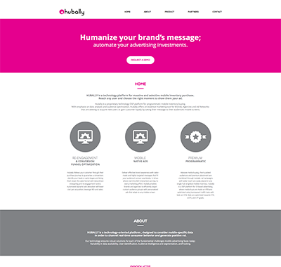
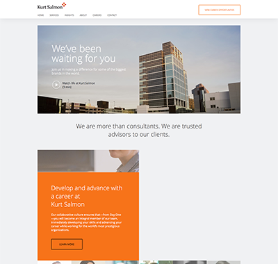
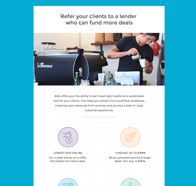

Clients trusted us with their web projects.
“For the last 5+ years, Pixel2HTML has been my secret weapon I keep in my back pocket. Even when I'm working with full-time internal teams, it's great to have a reliable resource that can step in and supplement our efforts. I've used other on-line resources, but none compare to this team.".
“Pixel2HTML pays a lot of attention to details, which is something that Auth0 values deeply. We've done 3 promo-sites with them and they were all delivered in time and with great quality thanks to the fluent communication we had with their team”.
“We needed a total overhaul on our Shopify site and Pixel2HTML really came through. I have been very impressed with their flexibility and eagerness to take on all of our ideas, no matter how big. We are extremely happy with what they have built for us and will continue to recommend them in the future.”
“Pixel2HTML has become an incredible resource for my team. I send them very extensive FrontEnd development work with very specific functionality requirements that are always met. They have an excellent project management staff that’s always there to ensure the project stays on course from start to finish.”.
"Pixel2HTML has shown nothing short of spectacular flexibility in development helping us understand the limits, potential and ultimately what creative solutions we could achieve together to build something wholly original on an ongoing basis. For years, they have been my number 1 recommendation every time anyone asks for help with what they do."
"We have a very complex site that had to be responsive and use a large amount of JavaScript. Pixel2Html built very clean html for us and simply did a great job. Their communication is great as is their work."