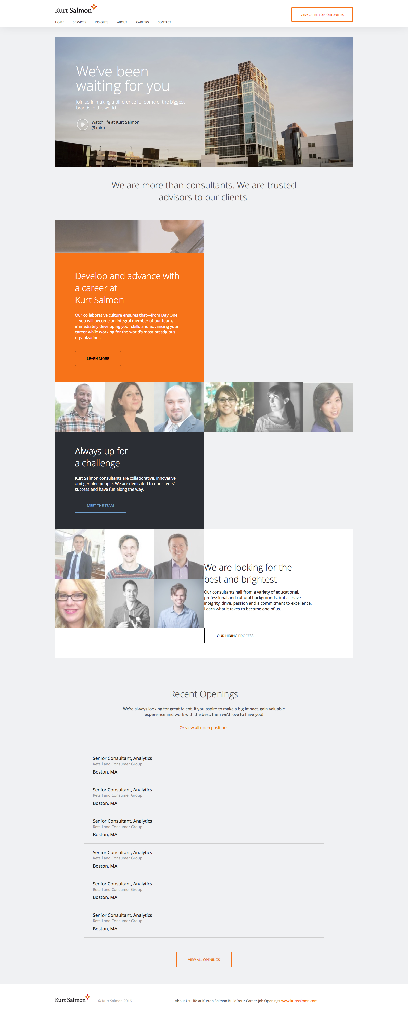
Kurt Salmon
We provided with HTML/CSS markup in a quick turnaround time for a designer client of us which later on was used to connect with a custom backend integration for this management consulting firm.
Take a look what we do!Kurt Salmon
HTML5/CSS3 with BEM and a responsive layout
<!DOCTYPE html>
<html lang="en" class="no-js">
<head>
<meta charset="utf-8">
<meta name="viewport" content="width=device-width, initial-scale=1, maximum-scale=1, minimal-ui">
<meta http-equiv="X-UA-Compatible" content="IE=edge">
<meta name="imagetoolbar" content="no">
<meta name="msthemecompatible" content="no">
<meta name="cleartype" content="on">
<meta name="HandheldFriendly" content="True">
<meta name="format-detection" content="telephone=no">
<meta name="format-detection" content="address=no">
<meta name="google" value="notranslate">
<meta name="apple-mobile-web-app-capable" content="yes">
<meta name="apple-mobile-web-app-status-bar-style" content="black-translucent">
<title></title>
<meta name="description" content="">
<meta name="keywords" content="">
<link href="https://fonts.googleapis.com/css?family=Open+Sans:400,300" rel="stylesheet">
<link href="styles/main.css" rel="stylesheet">
</head>
<body>
<header>
<div class="container">
<a href="/" class="logo">
<img src="static/img/logo.png" alt="" />
</a><a title=" OPPORTUNITIES" href="#" class="btn btn--header">VIEW CAREER<br/> OPPORTUNITIES</a>
<ul class="main-nav">
<li><a title="Home" href="#">Home</a>
</li>
<li><a title="Services" href="#">Services</a>
</li>
<li><a title="Insights" href="#">Insights</a>
</li>
<li><a title="About" href="#">About</a>
</li>
<li><a title="Careers" href="#">Careers</a>
</li>
<li><a title="Contact" href="#">Contact</a>
</li>
</ul>
</div>
</header>
<section class="home-hero-video">
<div class="container">
<div class="home-hero-video__item">
<div class="home-hero-video__text">
<h1>We’ve been waiting for you</h1>
<p>Join us in making a difference for some of the biggest brands in the world.</p>
</div>
<div class="home-hero-video__cta"><span class="cta-play js-show-modal"></span>
<p>Watch life at Kurt Salmon
<br/>(3 min)</p>
</div>
</div>
</div>
</section>
<section class="features">
<div class="container">
<h2>We are more than consultants. We are trusted advisors to our clients.</h2>
<div class="features__items">
<div class="features__item features-hero-img"></div>
<div class="features__item item--accent">
<h2>Develop and advance with a career at
<br/> Kurt Salmon</h2>
<p>Our collaborative culture ensures that—from Day One—you will become an integral member of our team, immediately developing your skills and advancing your career while working for the world’s most prestigious organizations.</p><a title="Learn More" href="#" class="btn btn--big btn--black">Learn More</a>
</div>
</div>
<div class="users-row clearfix">
<div class="users-row__item">
<img src="static/img/em12.jpg" alt="" />
</div>
<div class="users-row__item">
<img src="static/img/emp11.jpg" alt="" />
</div>
<div class="users-row__item">
<img src="static/img/emp10.jpg" alt="" />
</div>
<div class="users-row__item">
<img src="static/img/emp9.jpg" alt="" />
</div>
<div class="users-row__item">
<img src="static/img/emp8.jpg" alt="" />
</div>
<div class="users-row__item">
<img src="static/img/emp7.jpg" alt="" />
</div>
</div>
<div class="features__items">
<div class="features__item features__item--small">
<h2>Always up for<br/> a challenge</h2>
<p>Kurt Salmon consultants are collaborative, innovative and genuine people. We are dedicated to our clients' success and have fun along the way.</p><a title="Meet the team" href="#" class="btn btn--big btn--blue">Meet the team</a>
</div>
<div class="features__item features__item--users">
<div class="feature-user">
<img src="static/img/emp6.jpg" alt="" />
</div>
<div class="feature-user">
<img src="static/img/emp4.jpg" alt="" />
</div>
<div class="feature-user">
<img src="static/img/emp2.jpg" alt="" />
</div>
<div class="feature-user">
<img src="static/img/emp5.jpg" alt="" />
</div>
<div class="feature-user">
<img src="static/img/emp3.jpg" alt="" />
</div>
<div class="feature-user">
<img src="static/img/emp1.jpg" alt="" />
</div>
</div>
</div>
<div class="features__hiring clearfix">
<div class="hiring-img"></div>
<div class="hiring-text">
<h2>We are looking for the best and brightest</h2>
<p>Our consultants hail from a variety of educational, professional and cultural backgrounds, but all have integrity, drive, passion and a commitment to excellence. Learn what it takes to become one of us.</p><a title="OUR HIRING PROCESS" href="#" class="btn btn--black">OUR HIRING PROCESS</a>
</div>
</div>
</div>
</section>
<section class="jobs">
<div class="container">
<div class="jobs__header">
<h2>Recent Openings</h2>
<p>We’re always looking for great talent. If you aspire to make a big impact, gain valuable expereince and work with the best, then we’d love to have you!</p><a title="Or view all open positions" href="#" class="jobs__link">Or view all open positions</a>
</div>
<div class="jobs__items">
<div class="jobs__item">
<div class="item-desc"><a title="" href="#">Senior Consultant, Analytics<span>Retail and Consumer Group</span></a>
</div>
<div class="item-location">Boston, MA</div>
</div>
<div class="jobs__item">
<div class="item-desc"><a title="" href="#">Senior Consultant, Analytics<span>Retail and Consumer Group</span></a>
</div>
<div class="item-location">Boston, MA</div>
</div>
<div class="jobs__item">
<div class="item-desc"><a title="" href="#">Senior Consultant, Analytics<span>Retail and Consumer Group</span></a>
</div>
<div class="item-location">Boston, MA</div>
</div>
<div class="jobs__item">
<div class="item-desc"><a title="" href="#">Senior Consultant, Analytics<span>Retail and Consumer Group</span></a>
</div>
<div class="item-location">Boston, MA</div>
</div>
<div class="jobs__item">
<div class="item-desc"><a title="" href="#">Senior Consultant, Analytics<span>Retail and Consumer Group</span></a>
</div>
<div class="item-location">Boston, MA</div>
</div>
<div class="jobs__item">
<div class="item-desc"><a title="" href="#">Senior Consultant, Analytics<span>Retail and Consumer Group</span></a>
</div>
<div class="item-location">Boston, MA</div>
</div>
</div>
<div class="jobs__links"><a title="VIEW ALL OPENINGS" href="#" class="btn btn--big btn--orange">VIEW ALL OPENINGS</a>
</div>
</div>
</section>
<footer class="clearfix">
<div class="container">
<div class="footer__part">
<a href="/" class="footer__logo">
<img src="static/img/logo.png" alt="" />
</a><span>© Kurt Salmon 2016</span>
</div>
<ul class="footer__nav">
<li><a title="About Us" href="#">About Us</a>
</li>
<li><a title="Life at Kurton Salmon" href="life.html">Life at Kurton Salmon</a>
</li>
<li><a title="Build Your Career" href="#">Build Your Career</a>
</li>
<li><a title="Job Openings" href="jobs.html">Job Openings</a>
</li>
<li><a title="www.kurtsalmon.com" href="www.kurtsalmon.com">www.kurtsalmon.com</a>
</li>
</ul>
<ul class="footer__nav--tablet-port">
<li><a title="Life at Kurton Salmon" href="#">About Us</a><a href="life.html">Life at Kurton Salmon</a>
</li>
<li><a title="Job Openings" href="#">Build Your Career</a><a href="jobs.html">Job Openings</a>
</li>
<li><a title="www.kurtsalmon.com" href="www.kurtsalmon.com">www.kurtsalmon.com</a>
</li>
</ul>
</div>
</footer>
</body>
<script src="https://code.jquery.com/jquery-1.12.0.min.js"></script>
<script>
window.jQuery || document.write('<script src="static/js/vendor/jquery-1.12.0.min.js"><\/script>')
</script>
<script src="static/js/main.min.js"></script>
</html>
header {

  background: #ffffff;

  padding: 0.8em 0 0.6em;

  position: relative;

  box-shadow: 0px 1px 46px 0px rgba(0, 0, 0, 0.08);

}

header .btn {

  height: auto;

}

header .container {}

@media screen and (max-width: 48.125em) {

  header {

    padding: 0.8em 0 1em;

  }

}

@media screen and (max-width: 20em) {

  header {

    padding-left: 1.25em;

    padding-right: 1.125em;

  }

}

@media screen and (max-width: 64em) {

  header .container {

    padding-left: 3em;

    padding-right: 3em;

  }

}

@media screen and (max-width: 32.5em) {

  header .container {

    padding-left: 1.25em;

    padding-right: 1.125em;

  }

}

@media screen and (max-width: 20em) {

  header .container {

    padding-left: 0;

    padding-right: 0;

  }

}

.logo img {}

@media screen and (max-width: 28.75em) {

  .logo img {

    width: 113px;

    margin-top: 0.4em;

  }

}

.main-nav {

  list-style: none;

  padding: 0;

  margin: 0;

  text-transform: uppercase;

  margin-top: 1.562em;

}

.main-nav li {

  display: inline-block;

}

.main-nav li:not(:last-child) {

  margin-right: 1.875em;

}

.main-nav a {

  font-size: 0.75rem;

  color: #5A5A5A;

}

.main-nav a:hover, .main-nav a.is-active {

  color: #74A4C4;

}

@media screen and (max-width: 50.3125em) {

  .main-nav {

    display: none;

  }

}

footer {

  background: #ffffff;

  padding: 2.8em 0px 3.9em;

  font-size: 0.875rem;

  color: #AAA;

  text-align: center;

}

footer .container {}

footer span {

  display: inline-block;

  float: left;

  margin-top: 1.2em;

}

@media screen and (max-width: 64em) {

  footer {

    padding-top: 2.1em;

  }

}

@media screen and (max-width: 64em) {

  footer .container {

    max-width: 770px;

  }

}

@media screen and (max-width: 48.125em) {

  footer .container {

    max-width: 690px;

  }

}

@media screen and (max-width: 30em) {

  footer span {

    display: block;

    float: none;

    margin-top: 1.9em;

  }

}

.footer__part {

  margin-right: 2.2em;

  float: left;

}

@media screen and (max-width: 64em) {

  .footer__part {

    float: none;

    display: inline-block;

    margin-right: 0;

  }

}

.footer__logo {

  float: left;

  margin-right: 2.2em;

}

.footer__logo img {

  width: 138px;

}

@media screen and (max-width: 30em) {

  .footer__logo {

    margin: 0;

    float: none;

  }

}

.footer__nav {

  list-style: none;

  padding: 0;

  margin: 1.2em 0 0;

  display: -ms-flexbox;

  display: flex;

  -ms-flex-pack: justify;

      justify-content: space-between;

}

.footer__nav li {

  display: inline-block;

}

.footer__nav li:last-child a {

  color: #FF7300;

}

.footer__nav a {

  color: #5C5C5C;

}

@media screen and (max-width: 64em) {

  .footer__nav {

    width: 100%;

  }

}

@media screen and (max-width: 48.125em) {

  .footer__nav {

    display: none;

  }

}

.footer__nav--tablet-port {

  list-style: none;

  padding: 0;

  margin: 2.8em 0 0;

  display: -ms-flexbox;

  display: flex;

  -ms-flex-pack: justify;

      justify-content: space-between;

  -ms-flex-wrap: wrap;

      flex-wrap: wrap;

  display: none;

}

.footer__nav--tablet-port li {

  text-align: left;

}

.footer__nav--tablet-port li a:first-child {

  margin-bottom: 1.4em;

}

.footer__nav--tablet-port li:last-child a {

  color: #FF7300;

}

.footer__nav--tablet-port a {

  display: block;

  color: #5C5C5C;

}

@media screen and (max-width: 48.125em) {

  .footer__nav--tablet-port {

    display: -ms-flexbox;

    display: flex;

  }

}

@media screen and (max-width: 30em) {

  .footer__nav--tablet-port {

    margin-top: 1.4em;

  }

}

@media screen and (max-width: 30em) {

  .footer__nav--tablet-port li {

    width: 100%;

    text-align: center;

  }

  .footer__nav--tablet-port li:not(:last-child) a {

    margin-bottom: 1.4em;

  }

}

.home-hero-video {

  padding-top: 2.5em;

}

@media screen and (max-width: 28.75em) {

  .home-hero-video {

    padding-top: 2.3em;

  }

}

.home-hero-video__item {

  height: 508px;

  background: url('../static/img/hero-img.jpg') center center no-repeat;

  background-size: cover;

}

@media screen and (max-width: 48.125em) {

  .home-hero-video__item {

    margin-left: -1.25em;

    margin-right: -1.25em;

  }

}

@media screen and (max-width: 20em) {

  .home-hero-video__item {

    height: 582px;

    background: url('../static/img/hero-img-mobile.jpg') center center no-repeat;

    background-size: cover;

    margin-left: 0;

    margin-right: 0;

  }

}

.home-hero-video__text {

  max-width: 485px;

  color: #ffffff;

  margin-left: 5.15em;

  padding-top: 6.5em;

  padding-right: 1.25em;

}

.home-hero-video__text h1 {

  font-weight: 300;

  line-height: 1;

  margin: 0;

}

.home-hero-video__text p {

  font-size: 1.125rem;

  font-weight: 300;

  line-height: 1.3;

  margin-top: 1.4em;

}

@media screen and (max-width: 48.125em) {

  .home-hero-video__text {

    margin-left: 2.55em;

  }

}

@media screen and (max-width: 20em) {

  .home-hero-video__text {

    padding-top: 2.9em;

    margin-left: 0;

    padding-left: 1.25em;

  }

}

.home-hero-video__cta {

  margin-left: 5.15em;

}

.home-hero-video__cta p {

  display: inline-block;

  vertical-align: middle;

}

@media screen and (max-width: 48.125em) {

  .home-hero-video__cta {

    margin-left: 2.55em;

  }

}

@media screen and (max-width: 20em) {

  .home-hero-video__cta {

    margin-left: 0;

    padding-left: 1.25em;

  }

}

.cta-play {

  display: inline-block;

  width: 52px;

  height: 52px;

  background: url('../static/img/play-icon.png') center center no-repeat;

  background-size: cover;

  vertical-align: middle;

  margin-right: 0.3em;

  cursor: pointer;

}

.features {

  padding-top: 3em;

}

.features h2 {

  max-width: 727px;

  margin: 0 auto 1.9em;

  text-align: center;

}

@media screen and (max-width: 20em) {

  .features {

    padding-top: 1.8em;

  }

}

.features__items {

  display: -ms-flexbox;

  display: flex;

  -ms-flex-wrap: wrap;

      flex-wrap: wrap;

}

.features__item {

  width: 50%;

  padding-left: 4.9em;

  padding-top: 4.1em;

  padding-right: 5.9em;

  padding-bottom: 4em;

  background: #2B2E34;

  color: #ffffff;

}

.features__item .btn {

  font-size: 0.875rem;

}

.features__item h2 {

  text-align: left;

  color: #ffffff;

  margin: 0;

}

.features__item p {

  margin: 1.6em 0 2.6em;

}

@media screen and (max-width: 74.31em) {

  .features__item {

    padding-left: 2.5em;

    padding-right: 4.7em;

  }

}

@media screen and (max-width: 63.875em) {

  .features__item {

    padding-top: 2.4em;

  }

}

@media screen and (max-width: 48.125em) {

  .features__item {

    padding-left: 2.1em;

    padding-right: 0;

    padding-bottom: 4.7em;

  }

}

@media screen and (max-width: 43.75em) {

  .features__item {

    width: 100%;

    padding-left: 20px;

    padding-right: 20px;

    padding-bottom: 2.2em;

  }

}

@media screen and (max-width: 63.875em) {

  .features__item p {

    margin: 1.6em 0 1.8em;

  }

}

@media screen and (max-width: 20em) {

  .features__item p {

    margin: 2.9em 0 1.8em;

  }

}

.features__hiring {

  background: #ffffff;

  display: -ms-flexbox;

  display: flex;

  -ms-flex-wrap: wrap;

      flex-wrap: wrap;

}

@media screen and (max-width: 20em) {

  .features h2 {

    margin: 0 auto 1.4em;

  }

}

.item--accent {

  background: #FF7300;

}

.features-hero-img {

  background: url('../static/img/employee-img.jpg') center center no-repeat;

  background-size: cover;

}

@media screen and (max-width: 43.75em) {

  .features-hero-img {

    height: 179px;

  }

}

.users-row {}

.users-row__item {

  width: 16.666667%;

  float: left;

  position: relative;

  background: #ffffff;

}

.users-row__item img {

  opacity: 0.65;

}

.users-row__item img {

  display: block;

  position: absolute;

  left: 0;

  top: 0;

  width: 100%;

}

@media screen and (max-width: 43.75em) {

  .users-row__item {

    width: 33.3333333%;

  }

}

.users-row__item:after {

  content: '';

  display: block;

  padding-top: 100%;

}

.features__item--small {

  padding-top: 3.1em;

}

.features__item--small p {

  margin-bottom: 1.4em;

}

@media screen and (max-width: 74.31em) {

  .features__item--small {

    padding-top: 1.7em;

    padding-bottom: 2em;

  }

}

@media screen and (max-width: 63.875em) {

  .features__item--small {

    width: 100%;

  }

}

@media screen and (max-width: 48.125em) {

  .features__item--small {

    padding-bottom: 3.8em;

  }

}

@media screen and (max-width: 20em) {

  .features__item--small {

    padding-top: 3.7em;

    padding-bottom: 3.2em;

  }

}

@media screen and (max-width: 48.125em) {

  .features__item--small p {

    max-width: 396px;

  }

}

@media screen and (max-width: 20em) {

  .features__item--small p {

    margin-bottom: 2em;

    margin-top: -0.7em;

  }

}

.features__item--users {

  padding: 0;

}

@media screen and (max-width: 63.875em) {

  .features__item--users {

    width: 100%;

    -ms-flex-order: -1;

        order: -1;

  }

}

.feature-user {

  position: relative;

  width: 33.333333%;

  float: left;

  background: #ffffff;

}

.feature-user img {

  opacity: 0.65;

}

.feature-user img {

  position: absolute;

  top: 0;

  left: 0;

  display: block;

  width: 100%;

}

@media screen and (max-width: 63.875em) {

  .feature-user {

    width: 16.666667%;

  }

}

@media screen and (max-width: 43.75em) {

  .feature-user {

    width: 33.3333333%;

  }

}

.feature-user:after {

  content: '';

  display: block;

  padding-top: 100%;

}

.hiring-text {

  padding: 7.8em 10em 3.5em 7.8em;

  -ms-flex: 1;

      flex: 1;

}

.hiring-text a {

  font-size: 0.875rem;

}

.hiring-text h2 {

  text-align: left;

  margin-bottom: 0.4em;

  color: #2B2E34;

}

.hiring-text p {

  margin-bottom: 4em;

}

.hiring-text .btn {

  padding: 19px 48px 18px;

}

@media screen and (max-width: 74.31em) {

  .hiring-text {

    padding: 5.1em 4em 2em 2.5em;

  }

}

@media screen and (max-width: 48.125em) {

  .hiring-text {

    padding: 3.3em 4em 7.2em 2.5em;

  }

}

@media screen and (max-width: 43.75em) {

  .hiring-text {

    width: 100%;

    padding-left: 20px;

    padding-right: 30px;

    padding-top: 1.8em;

    padding-bottom: 3.3em;

  }

}

@media screen and (max-width: 48.125em) {

  .hiring-text p {

    margin-bottom: 2.4em;

  }

}

@media screen and (max-width: 20em) {

  .hiring-text p {

    margin-top: 3.9em;

    margin-bottom: 1.9em;

  }

}

.hiring-img {

  width: 40.154%;

  background: url('../static/img/employee-img1.jpg') bottom center no-repeat;

  background-size: cover;

}

@media screen and (max-width: 64em) {

  .hiring-img {

    width: 50%;

  }

}

@media screen and (max-width: 43.75em) {

  .hiring-img {

    width: 100%;

    height: 327px;

  }

}

.jobs {

  padding-top: 7.4em;

  padding-bottom: 4.1em;

}

.jobs a {

  color: #EC7404;

}

@media screen and (max-width: 48.125em) {

  .jobs {

    padding-top: 3.6em;

  }

}

.jobs__header, .jobs__footer {

  text-align: center;

  color: #505050;

}

.jobs__header h2, .jobs__footer h2 {

  color: #505050;

}

.jobs__header p, .jobs__footer p {

  max-width: 710px;

  margin: 1.5em auto 1.9em;

}

.jobs__items {

  margin: 4.7em auto 0;

  max-width: 940px;

}

@media screen and (max-width: 20em) {

  .jobs__items {

    margin: 4.1em auto 0;

  }

}

.jobs__item {

  display: -ms-flexbox;

  display: flex;

  -ms-flex-wrap: wrap;

      flex-wrap: wrap;

  font-size: 1.125rem;

  color: #222222;

  border-bottom: 1px solid #CECECE;

  padding: 0 1.9em 1.3em 1.9em;

}

.jobs__item span {

  display: block;

  font-size: 0.93rem;

  color: #959595;

}

@media screen and (max-width: 20em) {

  .jobs__item {

    font-size: 1rem;

    padding: 0 1.9em 1em 1.3em;

  }

}

.jobs__item:not(:last-child) {

  margin-bottom: 1.2em;

}

.jobs__links {

  text-align: center;

  padding: 3.5em 0 0;

}

.jobs__links a {

  font-size: 0.8125rem;

}

.item-desc {

  -ms-flex: 1;

      flex: 1;

}

@media screen and (max-width: 30em) {

  .item-desc {

    -ms-flex: auto;

        flex: auto;

    width: 100%;

  }

}

.item-location {

  padding-top: 0.5em;

}

@media screen and (max-width: 20em) {

  .item-location {

    padding-top: 0.1em;

  }

}

.inner-hero {

  height: 294px;

  position: relative;

  margin-top: 2.5em;

}

.inner-hero h1 {

  margin: 0;

  color: #ffffff;

  font-weight: 300;

  position: relative;

  top: 50%;

  transform: translateY(-50%);

  text-align: center;

}

.inner-hero--life {

  background: url('../static/img/life-hero.jpg') center center no-repeat;

  background-size: cover;

}

@media screen and (max-width: 48.125em) {

  .inner-hero {

    margin-top: 1.8em;

  }

}

@media screen and (max-width: 20em) {

  .inner-hero h1 {

    font-size: 2.5rem;

  }

}

.life-features {

  display: -ms-flexbox;

  display: flex;

  -ms-flex-wrap: wrap;

      flex-wrap: wrap;

}

.life-features__item {

  width: 50%;

  background: #ffffff;

}

.life-features__item h2 {

  color: #2a2a2a;

}

@media screen and (max-width: 20em) {

  .life-features__item h2 {

    font-size: 2.1875rem;

  }

}

@media screen and (max-width: 48.125em) {

  .life-features__item {

    width: 100%;

  }

}

.life-features__item:first-child {

  font-size: 1.5rem;

  padding: 3.3em 2em 1em 3.5em;

}

.life-features__item:first-child p {

  color: #2A2A2A;

}

@media screen and (max-width: 64em) {

  .life-features__item:first-child {

    padding: 3.3em 2em 1em 1.6em;

  }

}

@media screen and (max-width: 48.125em) {

  .life-features__item:first-child {

    padding: 1.6em 2em 3.4em 1.6em;

  }

}

@media screen and (max-width: 20em) {

  .life-features__item:first-child {

    padding: 1.6em 2em 2.3em 1.6em;

  }

}

.life-features__item:nth-child(2) {

  background: #25B0BA;

  color: #ffffff;

  padding: 5.2em 2em 6.1em 6.9em;

  font-weight: 300;

}

.life-features__item:nth-child(2) p + h3 {

  margin-top: 2.5em;

}

@media screen and (max-width: 64em) {

  .life-features__item:nth-child(2) {

    padding: 5.2em 2em 6.8em 3.5em;

  }

}

@media screen and (max-width: 48.125em) {

  .life-features__item:nth-child(2) {

    padding: 1.3em 2em 3em 2.5em;

  }

}

@media screen and (max-width: 20em) {

  .life-features__item:nth-child(2) {

    padding: 2.3em 2em 9em 1.2em;

  }

}

.life-video {

  height: 586px;

  background: url('../static/img/life-video-bg.jpg') bottom center no-repeat;

  background-size: cover;

  text-align: center;

  padding-top: 6.3em;

}

@media screen and (max-width: 64em) {

  .life-video {

    height: 494px;

  }

}

@media screen and (max-width: 48.125em) {

  .life-video {

    height: 365px;

    padding-top: 1.8em;

  }

}

.video-title {

  display: block;

  font-size: 2.5rem;

  color: #ffffff;

  margin-bottom: 1em;

}

.video-title br {}

@media screen and (max-width: 48.125em) {

  .video-title {

    font-size: 1.75rem;

  }

}

@media screen and (max-width: 30.375em) {

  .video-title br {

    display: none;

  }

}

.inner-play {

  display: inline-block;

  cursor: pointer;

}

.inner-play svg {

  width: 90px;

  height: 90px;

}

.life-career {

  padding-top: 4.5em;

  padding-bottom: 9.6em;

}

@media screen and (max-width: 48.125em) {

  .life-career {

    padding-top: 5.9em;

    padding-bottom: 10.8em;

  }

}

@media screen and (max-width: 20em) {

  .life-career {

    padding-top: 3em;

    padding-bottom: 9.3em;

  }

}

.life-career__item {

  width: 50%;

  margin: 0 auto;

}

@media screen and (max-width: 64em) {

  .life-career__item {

    width: 59%;

  }

}

@media screen and (max-width: 48.125em) {

  .life-career__item {

    width: 80%;

  }

}

@media screen and (max-width: 20em) {

  .life-career__item {

    width: 100%;

    padding: 0 1.25em;

  }

}

.life-career__header {

  font-size: 1.5rem;

}

.life-career__header h2 {

  color: #2A2A2A;

}

.life-career__header p {

  color: #2A2A2A;

}

@media screen and (max-width: 20em) {

  .life-career__header h2 {

    font-size: 2.1875rem;

  }

}

.life-career__list {

  list-style: none;

  padding: 0;

  margin: 2.7em 0 0;

  color: #222;

}

.life-career__list li {

  padding-left: 4.4em;

  position: relative;

}

.life-career__list li:before {

  content: '';

  width: 30px;

  height: 30px;

  border-radius: 50%;

  background: #D8D8D8;

  position: absolute;

  left: 0;

  top: 2px;

}

.life-career__list li:not(:last-child) {

  padding-bottom: 2.6em;

}

.life-career__list li:not(:last-child):after {

  content: '';

  width: 1px;

  height: 100%;

  background: #D8D8D8;

  position: absolute;

  top: 2px;

  left: 15px;

}

@media screen and (max-width: 20em) {

  .life-career__list li {

    padding-left: 0;

  }

}

@media screen and (max-width: 20em) {

  .life-career__list li:before {

    display: none;

  }

}

@media screen and (max-width: 20em) {

  .life-career__list li:not(:last-child):after {

    display: none;

  }

}

.list-header {

  display: block;

  font-size: 1.5rem;

  margin-bottom: 0.3em;

}

.life-training {

  background: #ffffff;

  padding-top: 5.4em;

  padding-bottom: 8.1em;

}

.life-training h2 {

  color: #2a2a2a;

}

.life-training h3 {

  color: #222222;

}

.life-training p {

  color: #222222;

}

.life-training h4 {

  color: #222222;

}

@media screen and (max-width: 20em) {

  .life-training h2 {

    font-size: 2.1875rem;

  }

}

@media screen and (max-width: 64em) {

  .life-training {

    padding-top: 3.6em;

  }

}

@media screen and (max-width: 64em) {

  .life-training {

    padding-top: 5em;

  }

}

@media screen and (max-width: 20em) {

  .life-training {

    padding-top: 3.7em;

    padding-bottom: 9em;

  }

}

.life-training__item {

  width: 50%;

  margin: 0 auto;

}

@media screen and (max-width: 64em) {

  .life-training__item {

    width: 59%;

  }

}

@media screen and (max-width: 48.125em) {

  .life-training__item {

    width: 80%;

  }

}

.life-training__header {

  font-size: 1.5rem;

}

.life-training__header p {

  margin-bottom: 1.5em;

  color: #2a2a2a;

}

.life-training + .jobs {

  padding-top: 5em;

}

@media screen and (max-width: 20em) {

  .life-training + .jobs {

    padding-top: 3em;

  }

}

.inner-hero--hiring {

  background: url('../static/img/hiring-hero.jpg') center center no-repeat;

  background-size: cover;

}

.hiring-features .life-features__item:first-child {

  padding: 4.6em 1.5em 1em 3.5em;

}

@media screen and (max-width: 64em) {

  .hiring-features .life-features__item:first-child {

    padding: 3.3em 2em 1em 1.6em;

  }

}

@media screen and (max-width: 48.125em) {

  .hiring-features .life-features__item:first-child {

    padding: 1.6em 2em 3.4em 1.6em;

  }

}

@media screen and (max-width: 20em) {

  .hiring-features .life-features__item:first-child {

    padding: 1.6em 2em 2.3em 1.6em;

  }

}

.hiring-features .life-features__item:nth-child(2) {

  background: #2B2E34;

  padding: 5.8em 2em 9.1em 7.1em;

}

@media screen and (max-width: 64em) {

  .hiring-features .life-features__item:nth-child(2) {

    padding: 5.2em 2em 6.8em 3.5em;

  }

}

@media screen and (max-width: 48.125em) {

  .hiring-features .life-features__item:nth-child(2) {

    padding: 1.3em 2em 3em 2.5em;

  }

}

@media screen and (max-width: 20em) {

  .hiring-features .life-features__item:nth-child(2) {

    padding: 2.3em 2em 9em 1.2em;

  }

}

.hiring-qualification {

  padding-top: 3.7em;

  padding-bottom: 4.2em;

  background: #F0F1F3;

}

.hiring-qualification .life-training__header p {

  margin-bottom: 0.9em;

}

.square-list {

  margin-top: 3.1em;

  list-style: none;

  padding-left: 1em;

}

.square-list li {

  position: relative;

}

.square-list li:before {

  content: '';

  width: 8px;

  height: 8px;

  background: #555555;

  position: absolute;

  top: 10px;

  left: -1em;

}

.square-list li:not(:last-child) {

  margin-bottom: 0.7em;

}

.job-post {

  background: #ffffff;

}

@media screen and (max-width: 20em) {

  .job-post {

    padding: 0 1.25em;

  }

}

.header--job-post {

  position: relative;

  box-shadow: 0px 1px 46px 0px rgba(0, 0, 0, 0.08);

}

.job-post__header {

  padding-top: 3.1em;

}

.job-post__header .btn--apply-job {

  float: left;

  margin-top: 3.6em;

  margin-left: 7.6em;

  padding: 19px 63px 18px;

  background: #FF7300;

  color: #ffffff;

}

@media screen and (max-width: 56.25em) {

  .job-post__header .btn--apply-job {

    margin-left: 19.4%;

  }

}

@media screen and (max-width: 37.5em) {

  .job-post__header .btn--apply-job {

    margin-left: 0;

  }

}

.job-post__title {

  width: 41.7%;

  float: left;

  margin-left: 19.4%;

}

.job-post__title h2 {

  color: #313131;

}

.job-post__title h2 {

  margin: 0 0 0.6em;

}

.job-post__title p {

  font-size: 1.125rem;

  color: #555555;

  margin: 0;

}

.job-post__title p + p {

  margin-top: 0.2em;

}

@media screen and (max-width: 56.25em) {

  .job-post__title {

    width: 61.6333%;

    float: none;

    margin: 0 auto;

  }

}

@media screen and (max-width: 37.5em) {

  .job-post__title {

    width: 100%;

  }

}

.content-flow {

  width: 61.6333%;

  margin: 4.5em auto 0;

  font-size: 0.875em;

  padding-bottom: 7em;

}

.content-flow p {

  line-height: 1.8;

  margin-bottom: 1.5em;

  color: #555;

}

.content-flow h3 {

  margin-top: 1.7em;

  margin-bottom: 0.9em;

  color: #555;

}

.content-flow h4 {

  font-size: 1.125em;

  margin-top: 2.9em;

  color: #555;

}

.content-flow .btn {

  padding: 19px 0 18px;

  width: 242px;

}

.content-flow .btn--apply-job {

  float: left;

  padding: 19px 0 18px;

  background: #FF7300;

  color: #ffffff;

  margin-right: 0.7em;

  width: 242px;

  margin-bottom: 1em;

}

.content-flow .square-list {

  margin-top: 1.4em;

  line-height: 1.8;

  margin-bottom: 3.7em;

}

.content-flow .square-list.qualification {

  max-width: 563px;

}

@media screen and (max-width: 37.5em) {

  .content-flow {

    width: 100%;

  }

}

@media screen and (max-width: 37.5em) {

  .content-flow .btn--apply-job {

    margin-bottom: 1em;

  }

}

.jobs-all {

  padding-top: 3.6em;

}

.jobs-all .jobs__items {

  margin: 6.1em auto 0;

}

.jobs-all .jobs__items .jobs__item {}

.jobs-all .jobs__items .jobs__item:nth-last-child(-n + 4) {}

.jobs-all .jobs__items .jobs__item:nth-last-child(-n + 10) {}

.jobs-all .jobs__link {}

.jobs-all .jobs__footer {

  padding: 4em 0 4.7em;

  color: #505050;

  font-size: 1.125rem;

  line-height: 1.4;

}

.jobs-all .jobs__footer a {

  color: #4A90E2;

}

@media screen and (max-width: 64em) {

  .jobs-all .jobs__items .jobs__item:nth-last-child(-n + 4) {

    display: none;

  }

}

@media screen and (max-width: 48.125em) {

  .jobs-all .jobs__items .jobs__item:nth-last-child(-n + 10) {

    display: none;

  }

}

@media screen and (min-width: 64.06em) {

  .jobs-all .jobs__link {

    display: none;

  }

}

@media screen and (max-width: 64em) {

  .jobs-all .jobs__footer {

    display: none;

  }

}

.jobs__item {

  position: relative;

  padding-top: 1.2em;

  cursor: pointer;

}

.jobs__item a {

  color: #222222;

}

.jobs__item:not(:last-child) {

  margin-bottom: 0;

}

.jobs__item:after {

  content: '';

  position: absolute;

  left: 0;

  top: 0;

  width: 100%;

  height: 100%;

  opacity: 0;

  box-shadow: 0px 1px 19px 0px rgba(0,0,0,0.12);

  transition: opacity 0.3s ease-in-out;

  z-index: -1;

}

.jobs__item:hover:after {

  opacity: 1;

}

.inner-hero--team {

  background: url('../static/img/team-hero.jpg') center center no-repeat;

  background-size: cover;

}

@media screen and (max-width: 48.125em) {

  margin-top: 1.8em;

}

.team {}

.team + .jobs {

  padding-top: 3.8em;

}

.team__header {

  width: 63.666666%;

  margin: 0 auto;

  padding-top: 2.3em;

}

.team__header h2 {

  margin-bottom: 0.7em;

  color: #2A2A2A;

}

.team__header p {

  font-size: 1.5rem;

  font-weight: 300;

  color: #2A2A2A;

}

@media screen and (max-width: 25em) {

  .team__header {

    width: 100%;

  }

}

@media screen and (max-width: 20em) {

  .team__header h2 {

    font-size: 2.1875rem;

  }

}

.team__members {

  padding-top: 3.3em;

  width: 86.833333%;

  margin: 0 auto;

  padding-bottom: 3.9em;

  display: -ms-flexbox;

  display: flex;

  -ms-flex-wrap: wrap;

      flex-wrap: wrap;

  flex-dirextion: row;

  -ms-flex-pack: justify;

      justify-content: space-between;

}

@media screen and (max-width: 25em) {

  .team__members {

    width: 100%;

    padding-bottom: 0;

  }

}

.team__member {

  width: calc((100% - 40px)/5);

  position: relative;

  overflow: hidden;

  margin-bottom: 10px;

}

.team__member img {

  position: absolute;

  left: 0;

  top: 0;

  max-width: 100%;

  opacity: 0.65;

}

@media screen and (max-width: 59.375em) {

  .team__member {

    width: calc((100% - 20px)/3);

  }

}

@media screen and (max-width: 34em) {

  .team__member {

    width: calc((100% - 10px)/2);

  }

}

.team__member:after {

  content: '';

  display: block;

  padding-top: 100%;

}

.team__member:hover .member-hover {

  opacity: 1;

  pointer-events: auto;

}

@media screen and (max-width: 59.375em) {

  .team__member img {

    width: 100%;

    max-width: none;

  }

}

.member-hover {

  width: 100%;

  height: 100%;

  position: absolute;

  top: 0;

  left: 0;

  background: rgba(255, 255, 255, 0.85);

  text-align: center;

  opacity: 0;

  pointer-events: none;

  transition: opacity 0.3s ease-in-out;

}

.member-hover span {

  display: block;

  margin-bottom: 1em;

}

.member-hover .name {

  font-size: 1.125rem;

}

.member-hover a {

  font-size: 0.75rem;

  color: #FF7300;

  text-transform: uppercase;

}

.member-hover__info {

  position: absolute;

  //: 100%;

  //: 100%;

  top: 50%;

  transform: translateY(-50%);

  color: #3E3E3E;

  padding: 1em;

}

@media screen and (max-width: 1040px) {

  .member-hover span {

    margin-bottom: 0.5em;

  }

}

.member-last {

  position: absolute;

  width: 100%;

  height: 100%;

  top: 0;

  left: 0;

  background: #3D3D3D;

  color: #F6F7F9;

  text-align: center;

}

.member-last span {

  position: absolute;

  width: 100%;

  top: 50%;

  left: 0;

  transform: translateY(-50%);

  padding: 0 1em;

}

.team__member.member--cta {

  width: calc(((100% - 40px)/5)*2 + 10px);

  margin-right: 0;

}

.team__member.member--cta a {

  position: absolute;

  top: 50%;

  left: 50%;

  transform: translate(-50%, -50%);

  width: 263px;

}

@media screen and (max-width: 59.375em) {

  .team__member.member--cta {

    width: calc(((100% - 20px)/3)*2 + 10px);

  }

}

@media screen and (max-width: 34em) {

  .team__member.member--cta {

    width: calc((100% - 10px)/2);

  }

}

.team__member.member--cta:after {

  padding-top: 50%;

}

@media screen and (max-width: 34em) {

  .team__member.member--cta a {

    border: none;

    width: 100%;

  }

}

.team__main-content {

  background: #ffffff;

}

.content-flow--team {

  width: 42.9333%;

  padding-top: 3.7em;

  padding-bottom: 2em;

  font-size: 1rem;

  color: #2A2A2A;

}

.content-flow--team p {

  line-height: 1.6;

  color: #2A2A2A;

}

.content-flow--team h2 {

  color: #2A2A2A;

}

.content-flow--team h4 {

  margin-top: 3.9em;

  margin-bottom: 0.9em;

  color: #1A1A1A;

}

.content-flow--team h4 + .square-list {

  margin-top: 0;

}

.content-flow--team .square-list + h4 {

  margin-top: -1em;

}

@media screen and (max-width: 37.5em) {

  .content-flow--team {

    width: 100%;

    padding: 3.7em 20px 2em;

  }

}

@media screen and (max-width: 20em) {

  .content-flow--team h2 {

    font-size: 2.1875rem;

  }

}

.content-flow__header {

  margin-bottom: 3.4em;

}

.content-flow__header p {

  font-size: 1.5rem;

  margin-top: 0.9em;

  line-height: 1.3;

  font-weight: 300;

  color: #2A2A2A;

}

.member-full-info-cover {

  position: absolute;

  width: 100%;

  left: 0;

  background: #3d3d3d;

}

.member-full-info {

  width: 100%;

  background: #3D3D3D;

  color: #F6F7F9;

  margin-top: 25px;

  margin-bottom: 28px;

  padding-left: 19.4%;

  padding-top: 5%;

  padding-bottom: 2.4em;

  display: -ms-flexbox;

  display: flex;

  -ms-flex-direction: row;

      flex-direction: row;

  -ms-flex-wrap: wrap;

      flex-wrap: wrap;

  display: none;

  position: relative;

  z-index: 9;

  transition: height .3s ease-in-out;

}

.member-full-info .arrow {

  width: 22px;

  height: 22px;

  background: #3d3d3d;

  transform: rotate(45deg);

  position: absolute;

  top: -10px;

  left: 0;

}

@media screen and (max-width: 56.25em) {

  .member-full-info {

    padding-left: 0;

    padding-top: 80px;

  }

}

.member-full-info:before {

  content: '';

  position: absolute;

  right: 100%;

  top: 0;

  height: 100%;

  width: 2000px;

  background: #3d3d3d;

}

.member-full-info:after {

  content: '';

  position: absolute;

  left: 100%;

  top: 0;

  height: 100%;

  width: 2000px;

  background: #3d3d3d;

}

.full-info-summary {

  width: 260px;

  font-size: 0.875rem;

  margin-right: 33px;

}

.full-info-summary p {

  margin: 0;

}

.full-info-summary img {

  width: 100%;

}

@media screen and (max-width: 37.5em) {

  .full-info-summary {

    width: 100%;

    margin-bottom: 1.5em;

  }

}

.full-info-content {

  -ms-flex: 1;

      flex: 1;

  font-size: 0.93rem;

  font-weight: 300;

  padding-right: 4em;

}

.full-info-content span {

  display: block;

}

.full-info-content p {

  margin-top: 0;

  margin-bottom: 1.3em;

}

@media screen and (max-width: 56.25em) {

  .full-info-content {

    padding-right: 0;

  }

}

@media screen and (max-width: 37.5em) {

  .full-info-content {

    width: 100%;

  }

}

.full-info-name {

  display: inline-block;

  font-size: 1.875rem;

  margin-top: 0.5em;

  margin-bottom: 0.2em;

  line-height: 1.4;

}

.close-full-info {

  width: 40px;

  height: 40px;

  background: url('../static/img/close-full-info.png') center center no-repeat;

  background-size: cover;

  position: absolute;

  right: 0;

  top: 20px;

}

/*

 * Set box-sizing to border-box in order not to be confused

 * with paddings and borders

 */

html {

  box-sizing: border-box;

  height: 100%;

  font-size: 16px;

}

*, *:before, *:after {

  box-sizing: inherit;

}

body {

  background: #F0F1F3;

  height: 100%;

  color: #2B2E34;

  font-family: 'Open Sans', sans-serif;

  font-size: 1rem;

}

.container {

  width: 100%;

  max-width: 1168px;

  margin: 0 auto

}

@media screen and (max-width: 74.25em) {

  .container {

    padding: 0 1.25em;

  }

  }

@media screen and (max-width: 20em) {

  .container {

    padding: 0;

  }

  }

.container:before, .container:after {

  content: " ";

  display: table;

}

.container:after {

  clear: both;

}

a {

  text-decoration: none;

  outline: none;

}

.btn {

  display: inline-block;

  font-size: 0.75rem;

  text-align: center;

  border: 2px solid #FF7300;

  border-radius: 3px;

  color: #FF7300;

  text-transform: uppercase;

  padding: 19px 34px 18px;

  outline: none;

  height: 60px;

}

.btn br {}

@media screen and (max-width: 48.125em) {

  .btn {

    padding: 15px 34px 13px;

  }

  }

@media screen and (max-width: 28.75em) {

  .btn {

    padding: 7px 21px 5px;

  }

  }

@media screen and (min-width: 28.75em) {

  .btn br {

    display: none;

  }

    }

.btn--header {

  float: right;

  margin-top: 15px;

}

@media screen and (max-width: 48.125em) {

  .btn--header {

    margin-top: 3px;

  }

}

.btn--big {

  padding: 19px 45px 18px;

}

.btn--black {

  color: #000000;

  border-color: #000000;

}

.btn--blue {

  border-color: #69A2CF;

  color: #69A2CF;

}

h1 {

  font-size: 3.5rem;

}

h2 {

  font-size: 2.1875rem;

  color: #555555;

  font-weight: 300;

  margin: 0

}

@media screen and (max-width: 20em) {

  h2 {

    font-size: 1.6875rem;

  }

  }

h3 {

  font-size: 1.375rem;

  font-weight: 300;

}

h4 {

  font-size: 1.1875rem;

  margin-top: 3.1em;

}

.overlay {

  position: fixed;

  width: 100%;

  height: 100%;

  top: 0;

  left: 0;

  background: #000000;

  opacity: 0.77;

  z-index: 8;

}

.modal-opened {

  overflow: hidden;

}

.modal {

  position: fixed;

  width: 80%;

  max-width: 939px;

  top: 50%;

  left: 50%;

  transform: translate(-50%, -50%);

  z-index: 9;

}

.video {

  height: 0;

  overflow: hidden;

  padding-bottom: 56.25%;

  position: relative;

}

embed, object, iframe {

  position: absolute;

  width: 100%;

  height: 100%;

  top: 0;

  left: 0;

  border: none;

}

.modal-close {

  position: absolute;

  top: -55px;

  right: -55px;

}

.modal-close svg {

  width: 40px;

  height: 40px

}

@media screen and (max-width: 39em) {

  .modal-close {

    top: -45px;

    right: -45px;

  }

  }

@media screen and (max-width: 31.25em) {

  .modal-close {

    right: -5px;

  }

  }

@media screen and (max-height: 27em) {

  .modal-close {

    top: -27px;

  }

  }

@media screen and (max-width: 39em) {

  .modal-close svg {

    width: 30px;

    height: 30px;

  }

    }

button {

  -webkit-appearance: none;

     -moz-appearance: none;

          appearance: none;

  border: none;

  background: transparent;

  outline: none;

}

/*

 * Remove the gap between audio, canvas, iframes,

 * images, videos and the bottom of their containers:

 * https://github.com/h5bp/html5-boilerplate/issues/440

 */

audio, canvas, iframe, img, svg, video {

    vertical-align: middle;

}

/*

 * Clearfix: contain floats

 *

 * For modern browsers

 * 1. The space content is one way to avoid an Opera bug when the

 *    `contenteditable` attribute is included anywhere else in the document.

 *    Otherwise it causes space to appear at the top and bottom of elements

 *    that receive the `clearfix` class.

 * 2. The use of `table` rather than `block` is only necessary if using

 *    `:before` to contain the top-margins of child elements.

 */

.clearfix:before, .clearfix:after {

    content: " "; /* 1 */

    display: table; /* 2 */

}

.clearfix:after {

    clear: both;

}

/* ==========================================================================

   Print styles.

   Inlined to avoid the additional HTTP request:

   http://www.phpied.com/delay-loading-your-print-css/

   ========================================================================== */

@media print {

    *, *:before, *:after, *:first-letter, *:first-line {

        background: transparent !important;

        color: #000 !important; /* Black prints faster:

                                   http://www.sanbeiji.com/archives/953 */

        box-shadow: none !important;

        text-shadow: none !important;

    }

    a, a:visited {

        text-decoration: underline;

    }

    a[href]:after {

        content: " (" attr(href) ")";

    }

    abbr[title]:after {

        content: " (" attr(title) ")";

    }

    /*

     * Don't show links that are fragment identifiers,

     * or use the `javascript:` pseudo protocol

     */

    a[href^="#"]:after, a[href^="javascript:"]:after {

        content: "";

    }

    pre, blockquote {

        border: 1px solid #999;

        page-break-inside: avoid;

    }

    /*

     * Printing Tables:

     * http://css-discuss.incutio.com/wiki/Printing_Tables

     */

    thead {

        display: table-header-group;

    }

    tr, img {

        page-break-inside: avoid;

    }

    img {

        max-width: 100% !important;

    }

    p, h2, h3 {

        orphans: 3;

        widows: 3;

    }

    h2, h3 {

        page-break-after: avoid;

    }

}
Other examples of our work


Clients trusted us with their web projects.
“For the last 5+ years, Pixel2HTML has been my secret weapon I keep in my back pocket. Even when I'm working with full-time internal teams, it's great to have a reliable resource that can step in and supplement our efforts. I've used other on-line resources, but none compare to this team.".
“Pixel2HTML pays a lot of attention to details, which is something that Auth0 values deeply. We've done 3 promo-sites with them and they were all delivered in time and with great quality thanks to the fluent communication we had with their team”.
“We needed a total overhaul on our Shopify site and Pixel2HTML really came through. I have been very impressed with their flexibility and eagerness to take on all of our ideas, no matter how big. We are extremely happy with what they have built for us and will continue to recommend them in the future.”
“Pixel2HTML has become an incredible resource for my team. I send them very extensive FrontEnd development work with very specific functionality requirements that are always met. They have an excellent project management staff that’s always there to ensure the project stays on course from start to finish.”.
"Pixel2HTML has shown nothing short of spectacular flexibility in development helping us understand the limits, potential and ultimately what creative solutions we could achieve together to build something wholly original on an ongoing basis. For years, they have been my number 1 recommendation every time anyone asks for help with what they do."
"We have a very complex site that had to be responsive and use a large amount of JavaScript. Pixel2Html built very clean html for us and simply did a great job. Their communication is great as is their work."