
Responsive Web Design: The Ultimate Guide
Introduction To Responsive Web Design
In today’s era of digitalization, web development is a constantly evolving field, and website owners constantly strive to provide a seamless user experience across all devices. This is where responsive web design comes into play.
Definition Of Responsive Web Design
Responsive web design (RWD) is an approach to designing and developing websites that respond to the user’s behavior and environment based on screen size, platform, and orientation. In simpler terms, it means designing a website that looks and functions perfectly on any device, whether a desktop computer, a tablet or a smartphone.
Importance Of Responsive Design In Modern Web Development
Responsive design is crucial in modern web development because it ensures that websites are accessible to users on any device. It allows users to navigate the website easily, regardless of their device. With the increasing usage of mobile devices, website owners must recognize the importance of a responsive design.
A Brief History Of Responsive Design
Responsive web design was first introduced by Ethan Marcotte in his article “Responsive Web Design” in May 2010. Since then, it has become an essential component of web development, and its popularity has only increased over time.
Benefits Of Responsive Web Design
The benefits of responsive web design are numerous. It provides an optimized viewing experience across different devices, which leads to higher user engagement and better conversion rates. It also eliminates the need for multiple website versions, reducing development time and costs.
Statistics Supporting The Need For Responsive Design
According to a survey by Statista, as of 2021, mobile devices accounted for 54.8% of global website traffic. This highlights the need for responsive design as users access websites on various devices. In addition, Google has stated that mobile-friendliness is a ranking factor in search engine results, making it even more important for website owners to have a responsive design.
In this article, readers can expect to learn about the importance and benefits of responsive web design. The history of responsive design and statistics supporting its need will also be discussed. Additionally, readers will learn how responsive design can improve user experience and drive better business outcomes.
The Principles Of Responsive Web Design
Responsive web design is an approach to designing and developing websites that respond to the user’s behavior and environment based on screen size, platform, and orientation. Here are the fundamental principles of responsive web design:
Fluid Grids
Definition Of Fluid Grids
Fluid grids are the backbone of responsive web design. A fluid grid is a grid system that adapts to different screen sizes and devices. It is defined in terms of proportions rather than pixels.
How Fluid Grids Differ From Fixed Grids
Unlike fixed grids, fluid grids can expand or contract based on the viewport’s size, allowing for a flexible layout that adjusts to the device’s screen size.
Examples Of Fluid Grid-Based Websites
Examples of fluid grid-based websites include The Boston Globe and The Guardian. These websites use fluid grids to create a seamless and consistent user experience across all devices.
Flexible Images And Media
Definition Of Flexible Images And Media
Flexible images and media are essential components of responsive web design. They allow images and media to scale up or down based on the viewport’s size.
Techniques For Implementing Flexible Images And Media
Techniques such as max-width, height auto, and percentage-based sizing can be used to implement flexible images and media. It’s also important to consider the format and size of the images and media to ensure they load quickly and don’t impact website performance.
Common Pitfalls To Avoid
Common pitfalls to avoid when implementing flexible images and media include using too large images, non-scalable images, and failing to optimize images for the web.
Media Queries
Definition Of Media Queries
Media queries apply different styles to a website based on the device used. They allow for creating breakpoints where the layout and content can be adjusted for optimal viewing on different devices.
Syntax For Writing Media Queries
The syntax for writing media queries includes specifying the type of media, the viewport size, and the styles to be applied.
Examples Of Media Queries In Action
Examples of media queries in action include changing the layout of a website from a two-column layout to a single-column layout for smaller screens.
Responsive Frameworks
Definition Of Responsive Frameworks
Responsive frameworks are pre-built libraries of code that make it easier to create responsive websites. They provide a set of pre-designed components and templates that can be used to build a website quickly.
Popular Responsive Frameworks
Popular responsive frameworks include Bootstrap and Foundation.
Pros And Cons Of Using Responsive Frameworks
The pros of using responsive frameworks include saving time, ensuring consistency across devices, and providing a solid foundation for website development. The cons include the potential for bloated code, limited design flexibility, and the need to update the framework regularly.
These principles are essential to creating a responsive website that adapts to different devices and screen sizes, providing users with a seamless and consistent user experience.
Best Practices For Responsive Web Design
Responsive web design is critical for providing a seamless user experience across devices. Here are some best practices to follow when designing and developing responsive websites:
Mobile-First Design
Definition Of Mobile-First Design
Mobile-first design is a design approach that prioritizes designing for mobile devices before scaling up for larger devices. It involves considering the constraints of mobile devices and designing with a focus on simplicity, efficiency, and ease of use.
Benefits Of Designing For Mobile-First
Benefits of mobile-first design include a better understanding of user needs, improved performance, and increased accessibility.
Techniques For Implementing Mobile-First Design
Techniques for implementing mobile-first design include starting with a simple layout, using mobile-friendly navigation, and designing for touch.
Content Prioritization
Importance Of Content Prioritization In Responsive Design
Content prioritization determines the most critical content and ensures it is visible and accessible on all devices. This is especially important for smaller devices where screen real estate is limited.
How To Prioritize Content For Different Devices
To prioritize content for different devices, identify the critical content that must be displayed on all devices. Use design elements like font size, color, and placement to highlight critical content. Then, consider the screen size of each device and how the content should be displayed on each device.
Testing And Debugging
Overview Of Responsive Design Testing
Testing and debugging are critical components of responsive web design. Testing involves checking a website’s functionality and design across different devices and screen sizes while debugging involves fixing any issues during testing.
Common Issues And How To Solve Them
Common issues with responsive design include layout and navigation issues, slow loading times, and too large images. Tools such as Google’s Mobile-Friendly Test and the Responsive Design Checker can help identify and solve these issues.
Performance Optimization
Importance Of Performance Optimization In Responsive Design
Performance optimization is essential for responsive web design. A slow-loading website can lead to a poor user experience and lower search engine rankings. To optimize website performance, consider using techniques such as compressing images, minifying code, and caching resources.
Tips For Improving Website Speed
Other tips for improving website speed include reducing HTTP requests, optimizing CSS and JavaScript files, and using a content delivery network (CDN) to serve website assets.
Accessibility
Definition Of Web Accessibility
Web accessibility refers to designing and developing websites that people with disabilities can use.
How Responsive Design Can Improve Accessibility
Responsive design can improve accessibility by making it easier for users with disabilities to access and navigate a website.
Tips For Designing For Accessibility
Tips for designing for accessibility include using descriptive alt text for images, providing video captions, using clear and easy-to-read fonts, and ensuring that all website functionality can be accessed with a keyboard.
Following these best practices will help you create a responsive website that provides a seamless user experience across devices while ensuring accessibility and performance.
Examples Of Great Responsive Web Design
Responsive web design has become the standard for websites that provide an optimal user experience on all devices. Here are some examples of great responsive design:
Overview Of Best Practices In Action
Many websites are excellent examples of responsive design that incorporates best practices. Airbnb’s website, for example, uses a mobile-first approach and prioritizes content based on screen size. The website’s design is simple, clean, and easy to use, with images and text that scale smoothly across devices.
Another great example is The New York Times’ website, which features a fluid grid layout that adjusts to the user’s screen size. The website also uses responsive images and media to provide a seamless reading experience across devices.
Case Studies Of Companies With Excellent Responsive Design
Many companies have embraced responsive design and have seen great results. Starbucks, for example, saw a 15% increase in mobile orders after launching their responsive website, while The Boston Globe saw a 90% increase in mobile traffic after switching to responsive design.
Other companies with excellent responsive design include Disney, which uses responsive design to provide a seamless user experience across its various websites, and Slack, which uses responsive design to ensure its communication platform is accessible on all devices.
Examples Of Responsive Design That Incorporate Unique Or Innovative Features
Some websites use responsive design to incorporate unique or innovative features. One example is Apple’s website, which uses a parallax scrolling effect to create a dynamic, engaging user experience. The website also uses responsive design to adjust the layout and content based on the user’s device.
Another example is Boston Dynamics’ website, which uses responsive design to provide a unique experience for desktop and mobile users. The website features a 3D animation that can be controlled with the mouse or touch on mobile devices.
Comparison Of Responsive Design Vs. Separate Mobile Sites
Responsive design is often compared to separate mobile sites designed specifically for mobile devices. While separate mobile sites can be effective, they require separate development and maintenance and can lead to content and user experience inconsistencies.
On the other hand, responsive design provides a consistent user experience across devices and is more cost effective and efficient to develop and maintain. Some examples of companies that have switched from separate mobile sites to responsive design include Time Magazine and LinkedIn.
In conclusion, the excellent responsive design incorporates best practices, provides a seamless user experience, and can incorporate unique or innovative features. Compared to separate mobile sites, responsive design is often the more efficient and cost-effective choice.
Future Of Responsive Web Design
Responsive web design has come a long way since its inception and has become essential to modern web development. Here are some insights into the future of responsive web design:
Emerging Trends And Technologies
As technology advances, new trends, and technologies are shaping the future of responsive design. One of the emerging trends is the use of variable fonts, which can change their weight, width, and other characteristics. Variable fonts can provide more design flexibility and can be used to optimize typography across different screen sizes.
Another emerging technology is progressive web apps (PWAs), websites that behave like native apps. PWAs can provide an app-like experience on any device and can be accessed without installing or downloading.
Potential Impact Of Ai On Responsive Design
Artificial intelligence (AI) has the potential to revolutionize responsive design by automating many of the design and development tasks. AI can analyze user data and behavior to optimize website design and content. It can also automate creating and optimizing layouts and design elements based on user preferences and behavior.
Predictions For The Future Of Responsive Design
The future of responsive design is bright, and many experts predict that it will continue to evolve and adapt to new technologies and user needs. One of the predictions is that responsive design will become more personalized, with websites adapting to the user’s preferences and behavior.
Another prediction is that responsive design will become more inclusive and accessible, with websites designed to meet the needs of all users, including those with disabilities. This can be achieved through advanced technologies such as AI and machine learning, which can analyze user data and provide more personalized and accessible experiences.
The future of responsive web design is exciting, with emerging trends and technologies shaping how websites are designed and developed. As technology advances, responsive design will continue to evolve and adapt to meet the changing needs of users.
Pixel2html: The Game-Changing Responsive Web Design Agency That’s Taking The Industry By Storm
Introduction
In today’s digital age, having a website that is responsive and accessible across all devices is crucial. And that’s where Pixel2HTML comes in. This innovative agency is revolutionizing the web design industry with its game-changing approach to responsive design.
Overview Of Pixel2html
Founded in 2008, Pixel2HTML is a full-service agency specializing in responsive web design, email development, and Custom WordPress development. The agency has a team of highly skilled designers and developers who are passionate about creating high-quality, responsive websites that are optimized for all devices.
Expertise In Responsive Web Design
One of the agency’s core strengths is its expertise in responsive web design. Their team of designers and developers is skilled in creating websites that adapt to any screen size or device. Whether it’s a desktop computer, tablet, or smartphone, Pixel2HTML’s websites are designed to provide a seamless user experience across all devices.
Commitment To Quality And Customer Satisfaction
What sets Pixel2HTML apart from other web design agencies is its commitment to quality and customer satisfaction. The agency follows a rigorous design process that ensures every website they create is of the highest quality. From the initial consultation to final delivery, Pixel2HTML works closely with its clients to ensure their website meets their exact requirements.
Recognition And Awards
Pixel2HTML’s work has been recognized by leading industry publications and has won numerous awards for its outstanding work. They have worked with clients ranging from small startups to large corporations.
Innovation And Future Of Pixel2html
Pixel2HTML’s success can be attributed to its commitment to quality, customer satisfaction, and innovation. They constantly push the boundaries of what is possible in web design and always look for new and innovative ways to improve their services.
If you’re looking for a game-changing responsive web design agency taking the industry by storm, look no further than Pixel2HTML. With their innovative approach, commitment to quality, and track record of success, Pixel2HTML is the agency to choose for your next web design project.
Frequently Asked Questions (Faqs)
What Is The Difference Between Responsive Design And Adaptive Design?
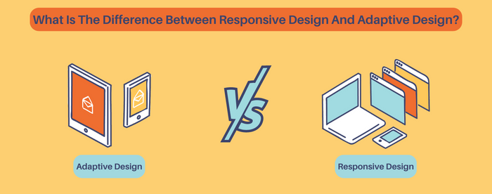
Responsive and adaptive designs are two approaches to creating websites optimized for various screen sizes and devices. Responsive design uses fluid grids and flexible elements to adjust a website’s layout based on screen size. Adaptive design uses predefined layouts for specific screen sizes. Responsive design is more flexible and future-proof than adaptive design.
What Is The Impact Of Responsive Design On SEO?

Responsive design can positively impact SEO because it helps improve website usability and user experience, which are essential ranking factors. By providing a seamless experience across all devices, responsive design can also help reduce bounce rates and increase engagement, improving search engine rankings.
Is Responsive Design Necessary For All Websites?

Responsive design is not necessary for all websites, but it is highly recommended for any website that wants to provide a good user experience on different devices. Optimizing a mobile website is becoming increasingly important with the increasing use of mobile devices to access the internet.
How Do I Test My Website For Responsiveness?

Several tools are available to test website responsiveness, including Google’s Mobile-Friendly Test, which analyzes a website and provides feedback on its mobile-friendliness. Other tools include BrowserStack, which allows you to test your website on different devices and browsers, and Responsinator, which shows how your website looks on different devices.
How Do I Optimize Images For Responsive Design?

To optimize images for responsive design, you can use techniques such as scaling, cropping, and compressing images. You can also use responsive image solutions such as ‘srcset’ and sizes attributes to serve different image sizes to different devices.
Can I Retrofit An Existing Website With Responsive Design?
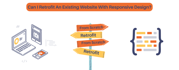
It is possible to retrofit an existing website with a responsive design. However, the process can be complex and time-consuming, depending on the complexity of the website. Sometimes, starting from scratch and building a new responsive website may be more efficient.
How Do I Know If My Website Needs Responsive Design?
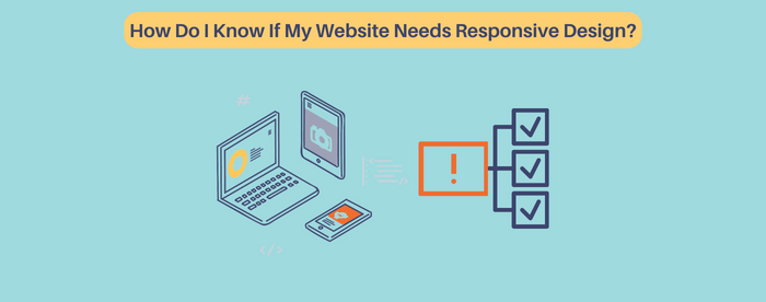
If your website needs to be optimized for mobile devices or experiencing high bounce rates or low engagement, consider implementing a responsive design. You can also use Google Analytics to track your website’s traffic and see how many visitors are accessing your website from mobile devices.
How To Check If A Website Is Responsive Or Not?
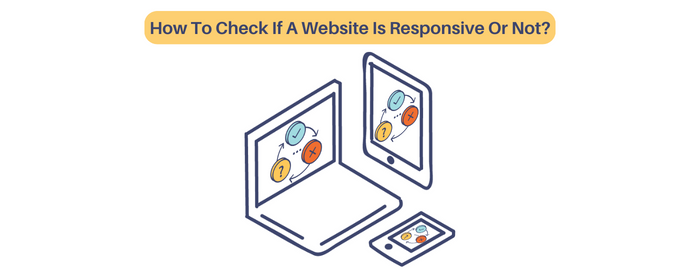
You can check if a website is responsive by opening it on different devices with different screen sizes or by using tools such as Google’s Mobile-Friendly Test, which analyzes a website and provides feedback on its mobile-friendliness.
How Do You Decide Whether To Use Responsive Design Or A Separate Mobile Site?

Responsive design provides a consistent user experience across all devices and can be more cost-effective in the long run. The decision to use responsive design or a separate mobile site depends on the website’s content, target audience, and budget. A separate mobile site may be necessary for websites with sizeable mobile traffic or specific functionalities. Conducting research and consulting with a professional web developer is recommended.